Team Creatif is bringing Panzani up with a new identity that reflects the modern roots, expertise and commitments of the French pasta brand with its delicious Italian accents.
Discover the new corporate identity of Panzani Group !
The agency’s mission is to redesign the brand’s platform and values, by delving into its history, DNA and commitments.
A strong identity that reflects the power of the brand
Team Creatif revealed and refreshed the brand’s assets while respecting Panzani’s heritage and history.
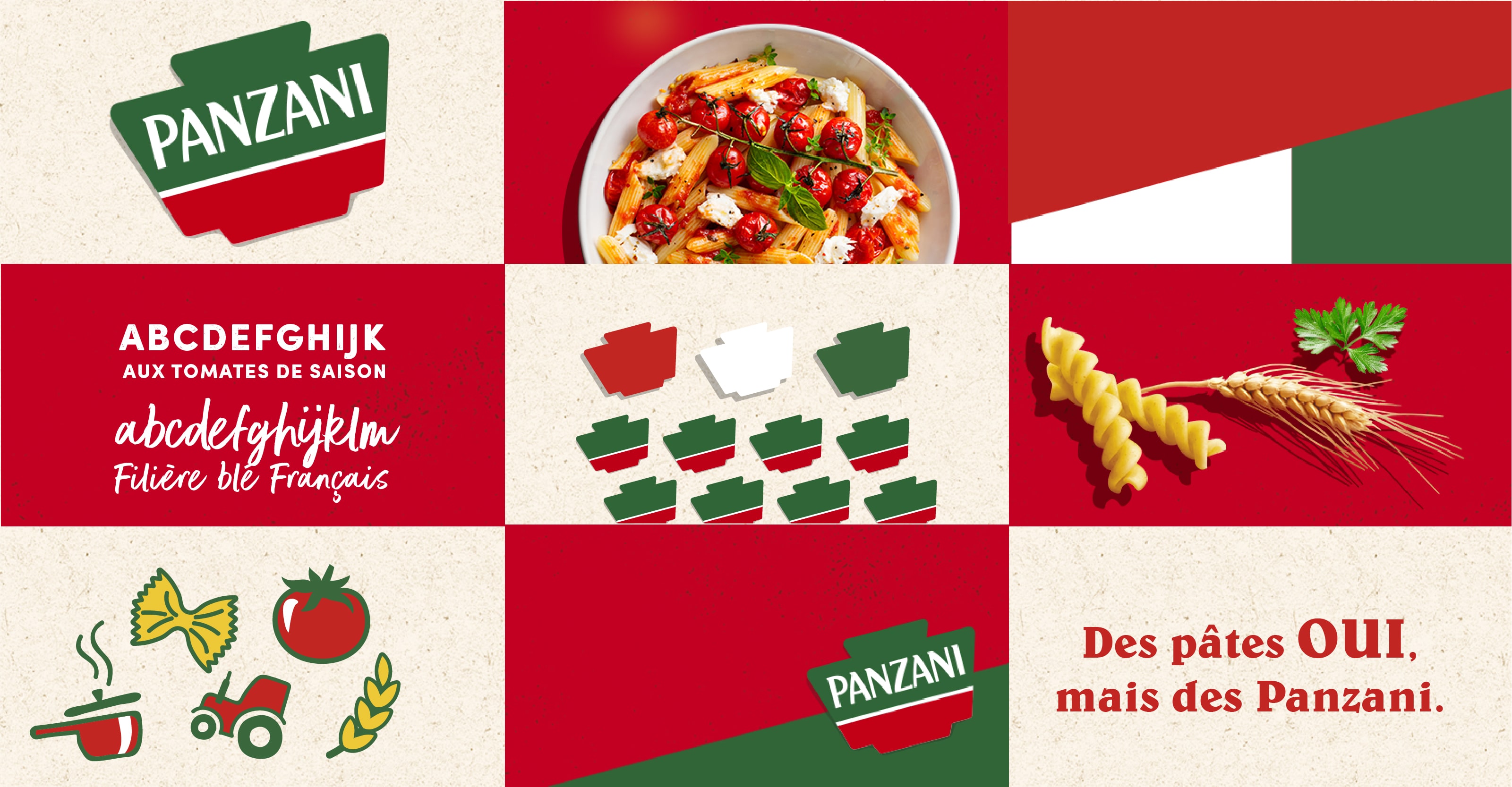
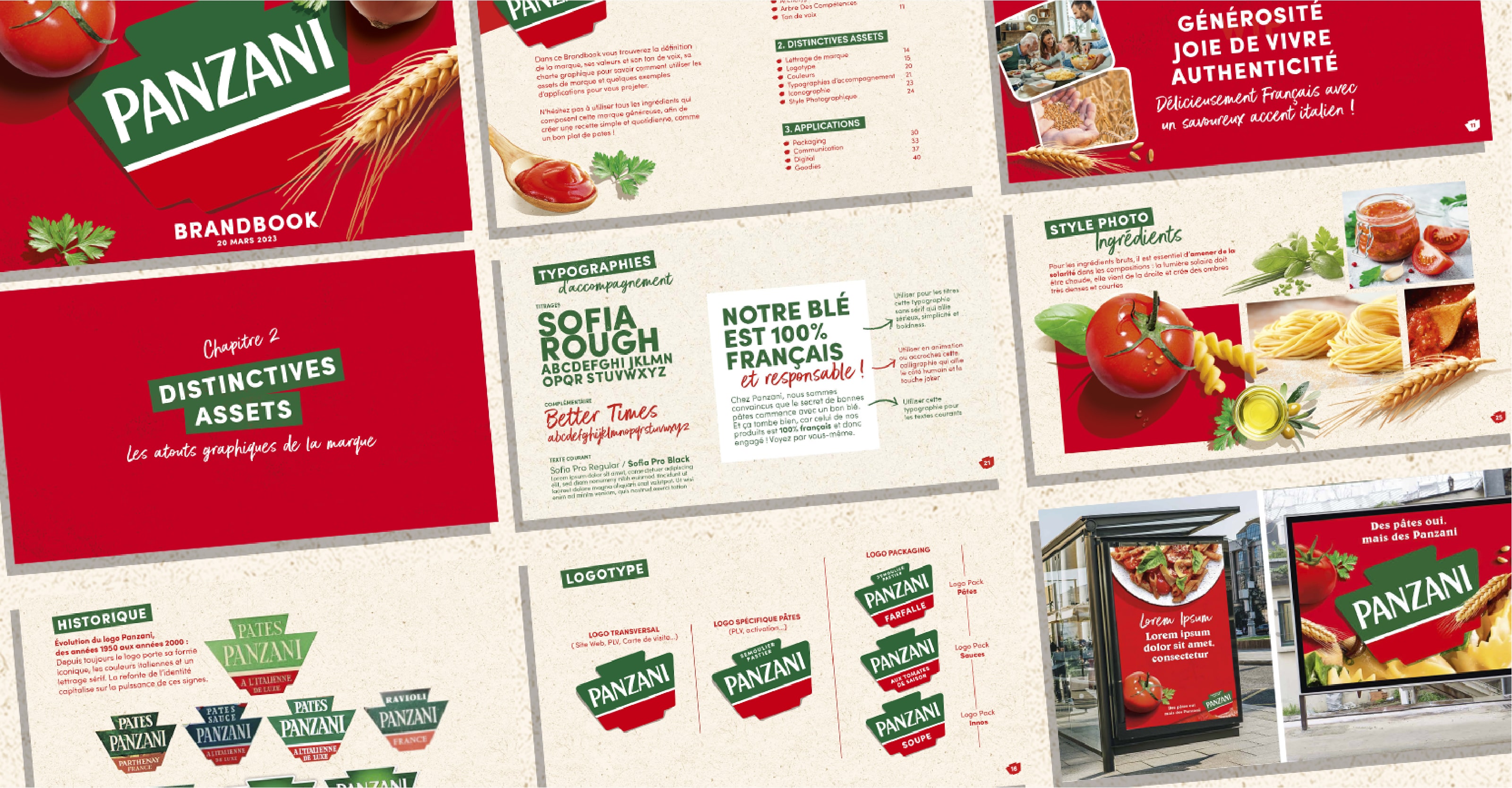
The new identity is based on the brand’s roots, with a redesign of the original logotype and colours that echo the Italian origins of its founder, Jean Panzani. The visuals are sunny, shiny and simple, reflecting Panzani’s values of accessibility and joy. A dynamic, modern structure that reflects the brand’s jovial character.
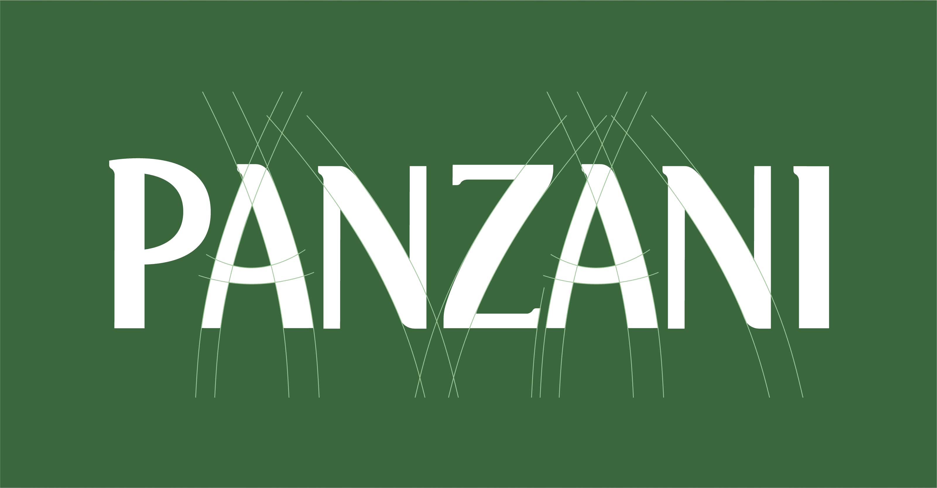
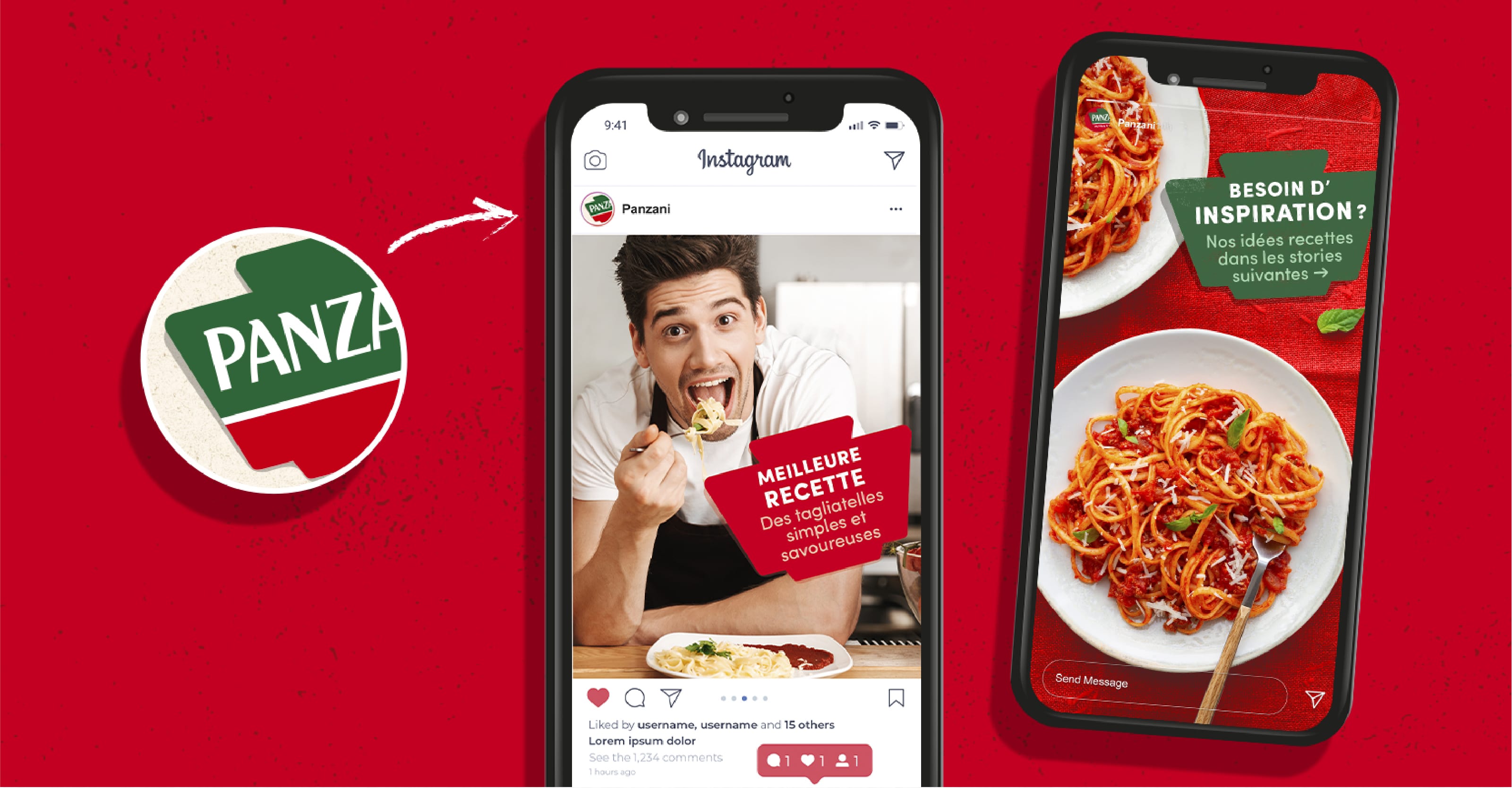
The Panzani typography has been reworked to make it more generous and rounded. The brand universe is deployed across all media to convey the generous, joyful and authentic aspect of the brand.
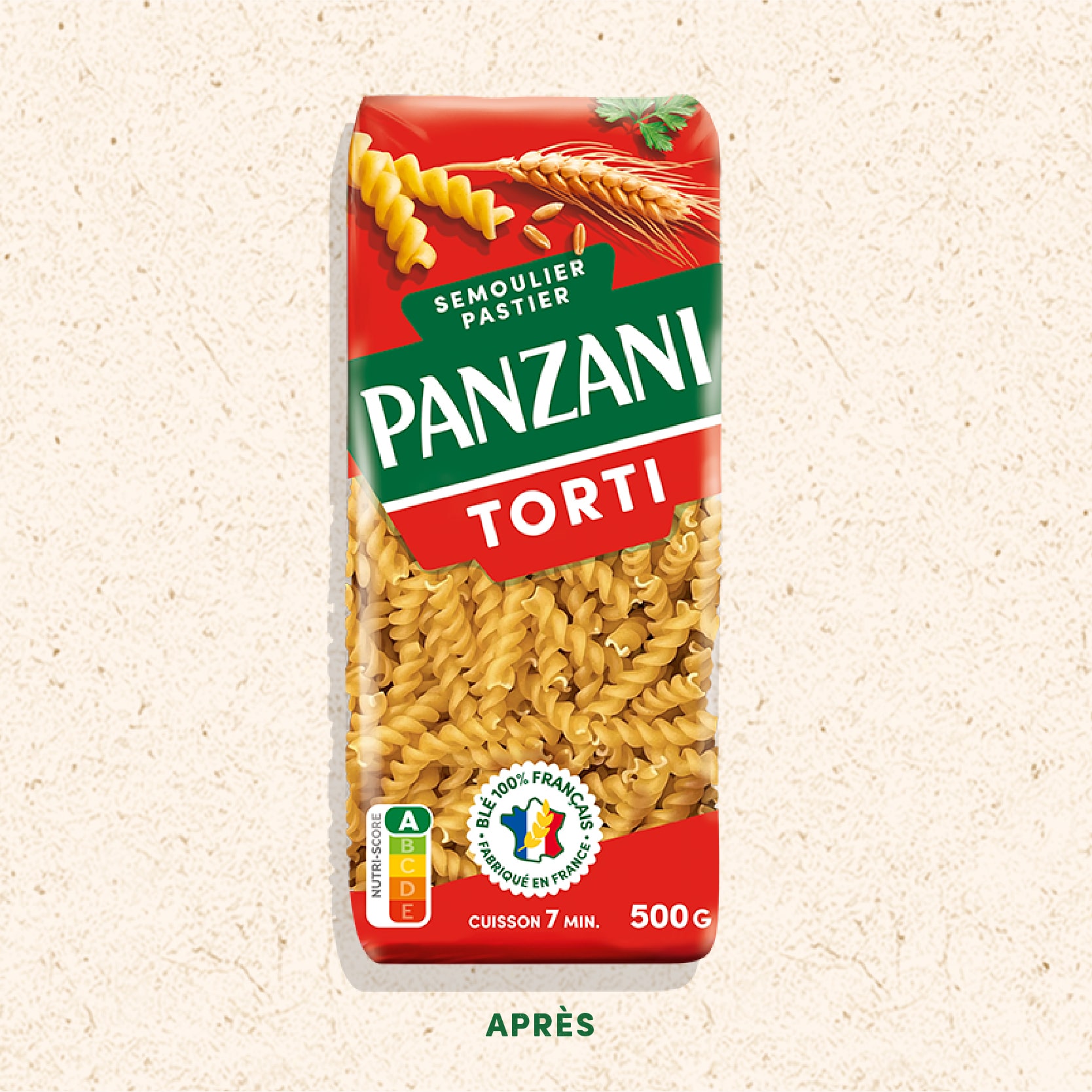
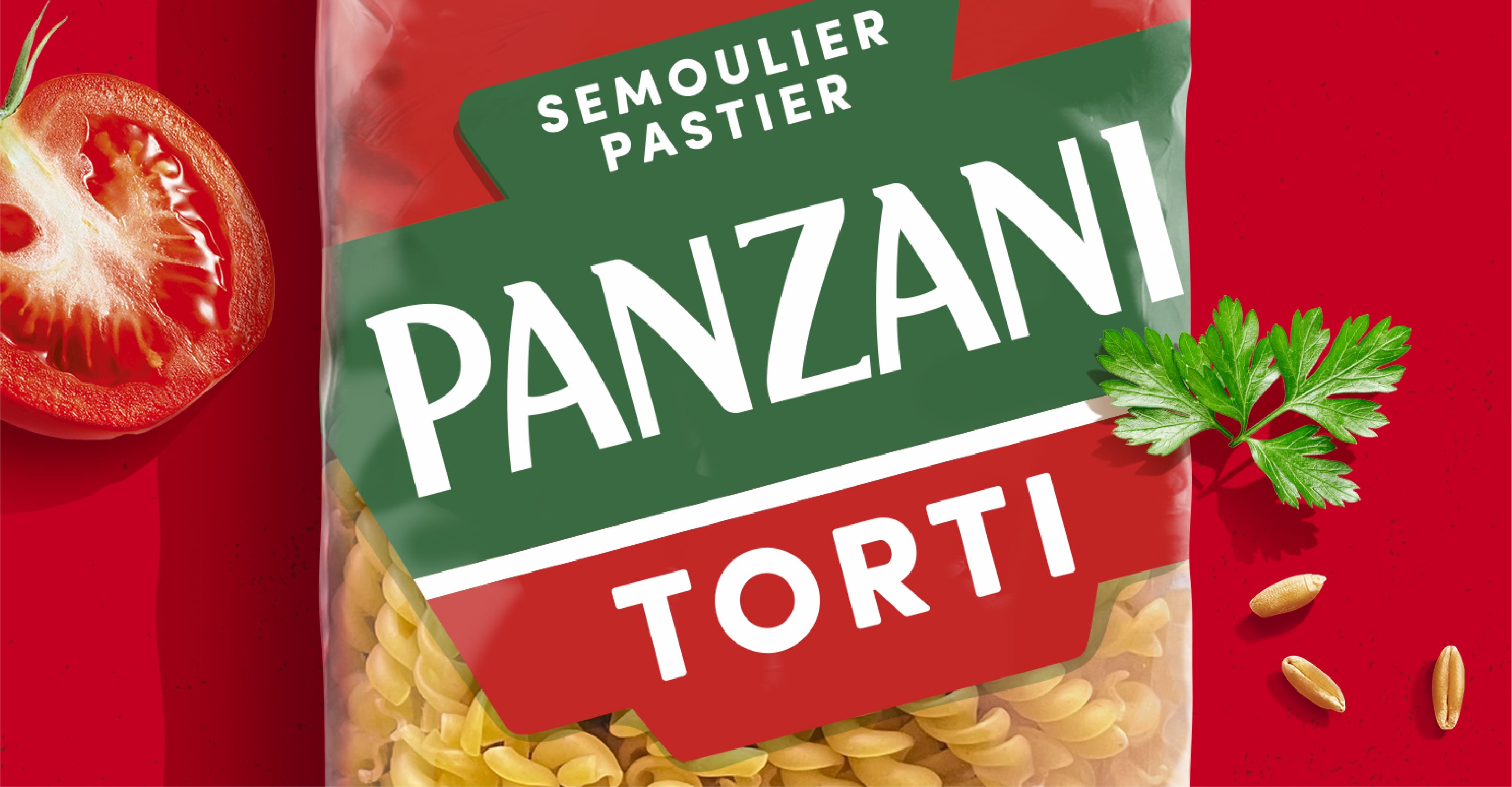
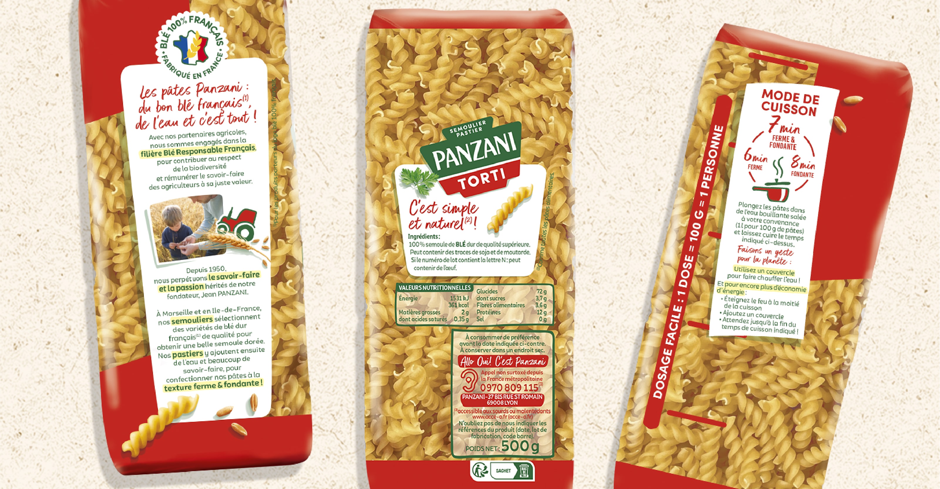
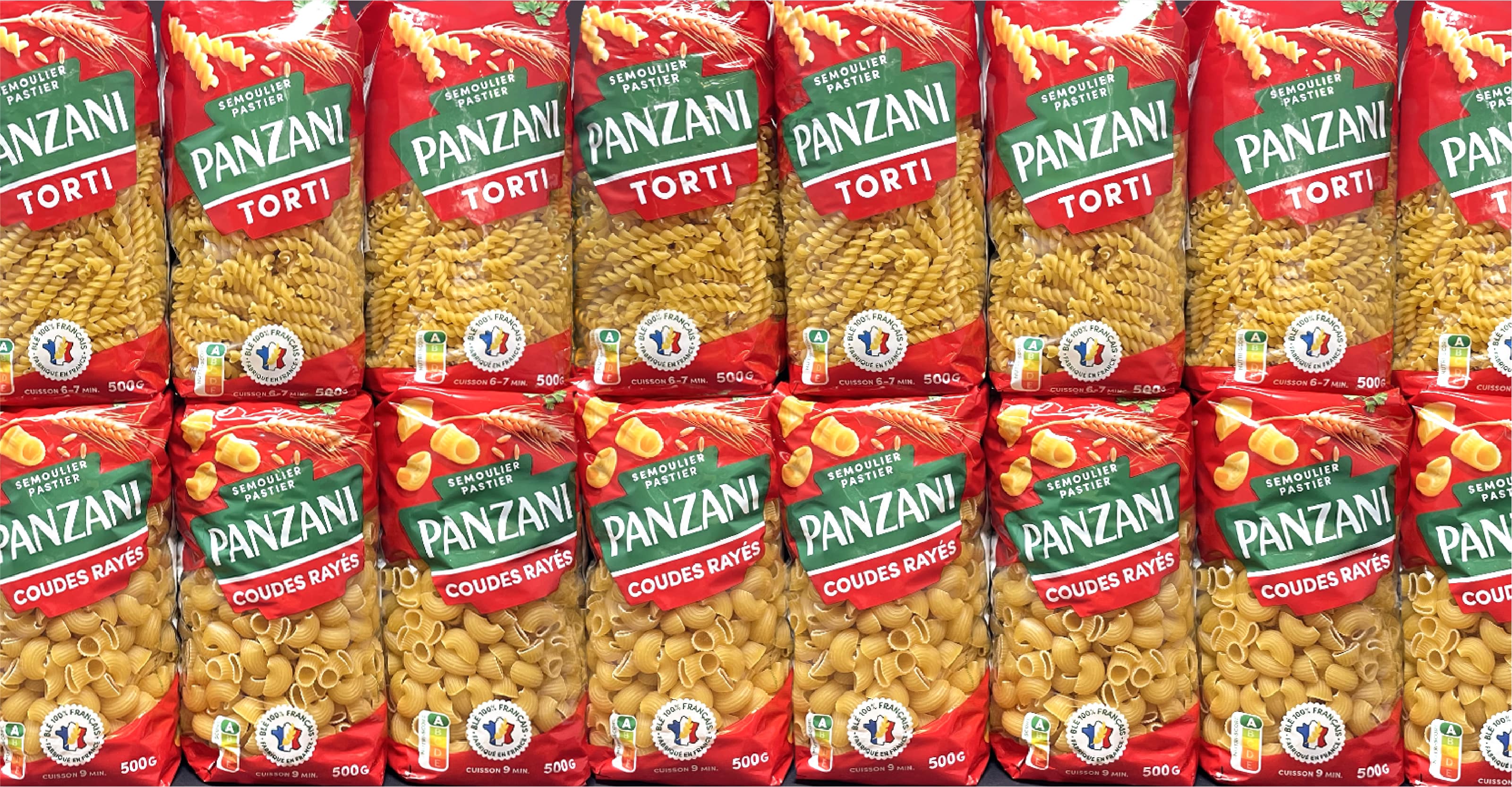
A new packaging identity
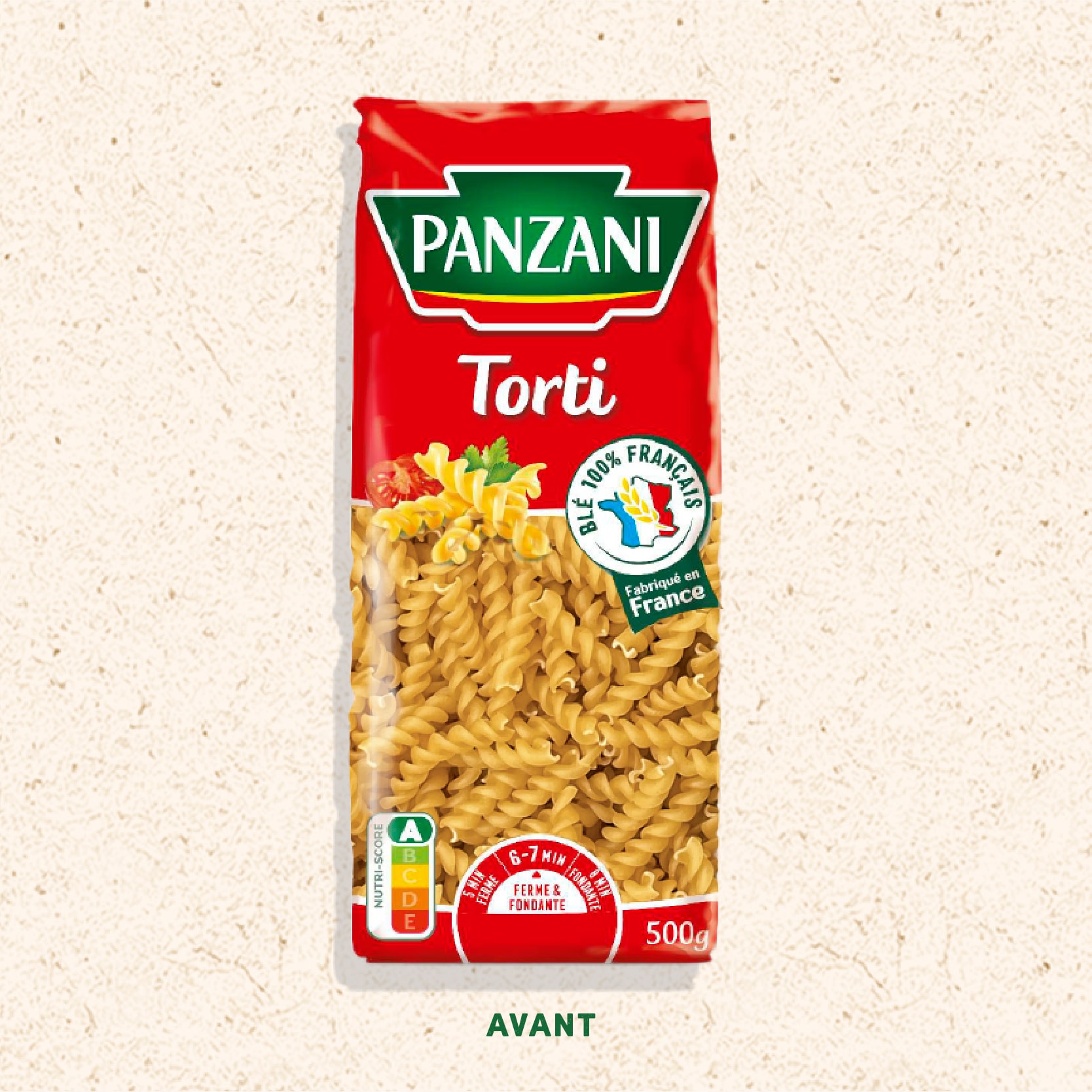
The iconic logo is fully embraced to highlight the brand and its historic expertise at Semoulier-Pastier.
Transparency gives pride of place to the product, which is also enhanced by the brand’s own commitment to the 100% French wheat, made in France.
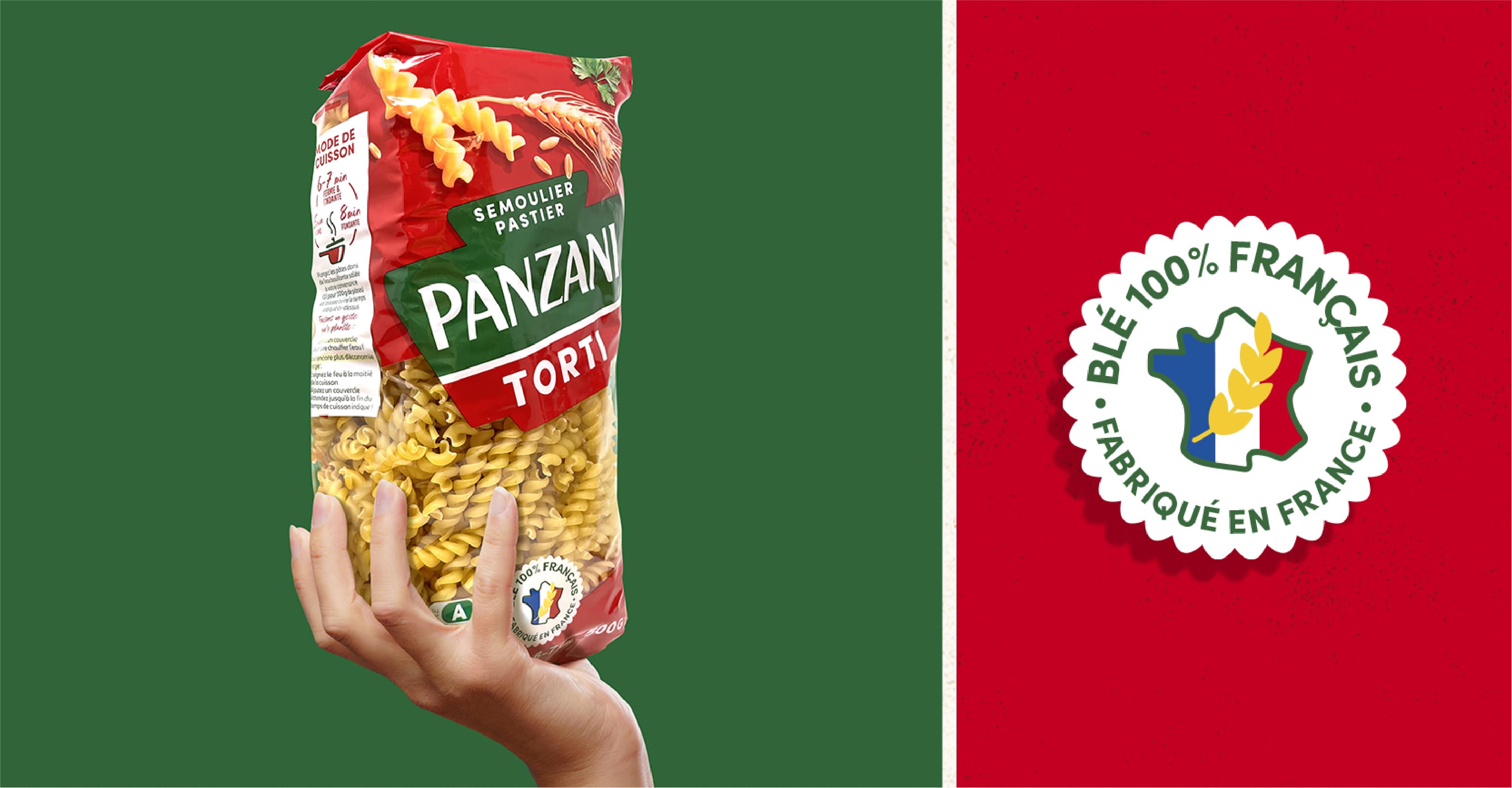
The brand’s commitments, such as the French wheat sector, are explained in an educational way to highlight the upstream agricultural work. Consumers are given spontaneous guidance on cooking times and dosage on the side.
Red colour branding has a high impact on the shelf and creates excellent brand identification.
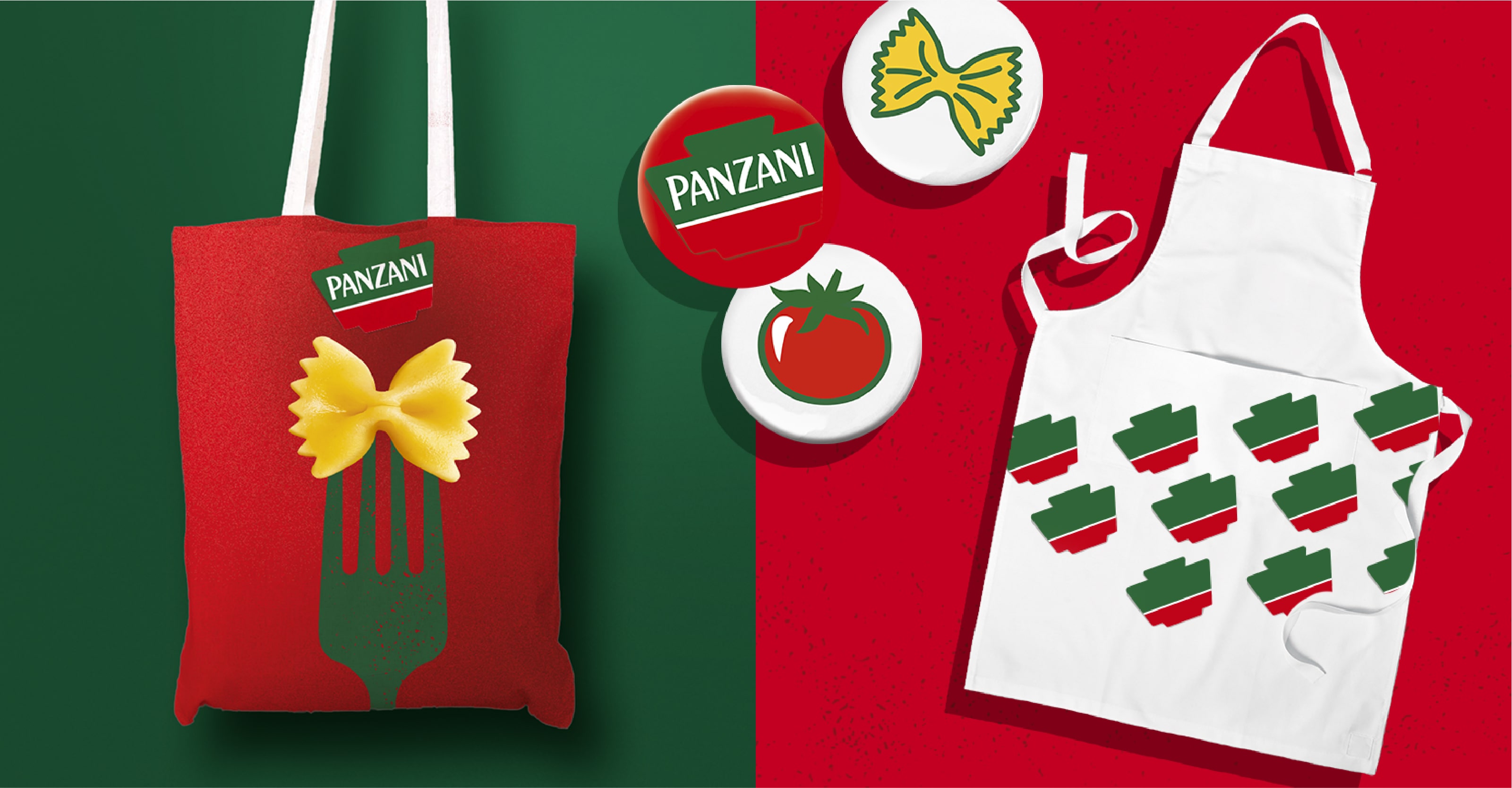
Team Creatif created the brandbook. This enables Panzani to communicate its values and distinctive assets. The brandbook also enables the brand to guide its communications on different media.
In conclusion, thanks to all these brand signs, Panzani is becoming more modern and dynamic, while respecting its values.