For 40 years, Arkopharma scientists, naturopaths, biologists… have been carefully choosing the best of nature to prevent and relieve everyday ailments. Thanks to their modern pharmaceutical expertise, they transform the incredible intelligence of nature into natural solutions by combining science, creativity and safety, while respecting people and the planet. By digging into this history and the company’s DNA, we were able to define its deep personality, thanks to the archetype, and thus redefine the brand’s positioning together.
Arkopharma logotype
Based on this founding work, we imagined and designed a new logo to reflect this strong link between Science and Nature. The grey semicircle reminds us of the roundness of a petri dish, in which Nature is immersed in the form of a leaf.

A new packaging
As a Leader & Explorer and to better reflect their natural and unchanging values, the laboratory wanted to rethink its packaging. The aim : to create a strong and unique brand identity, where the benefit is at the centre of the consumer promise.
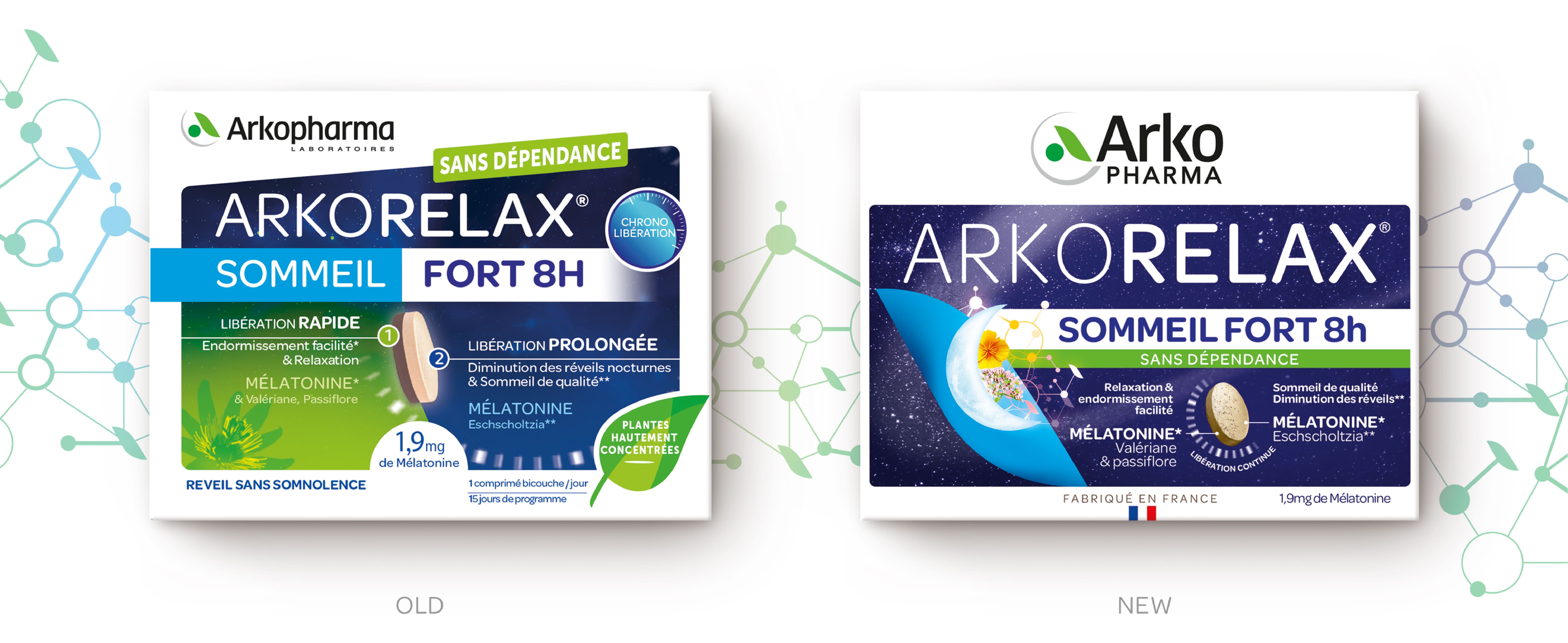
Already reflected in our logo, the combination of science and nature is also visible in all the identity. The leaf becomes an iconic and central visual in each of our creations. It acts as an element of identification and differentiation at the heart of the packaging. From this leaf emanate molecules and natural ingredients that make our formulas unique.
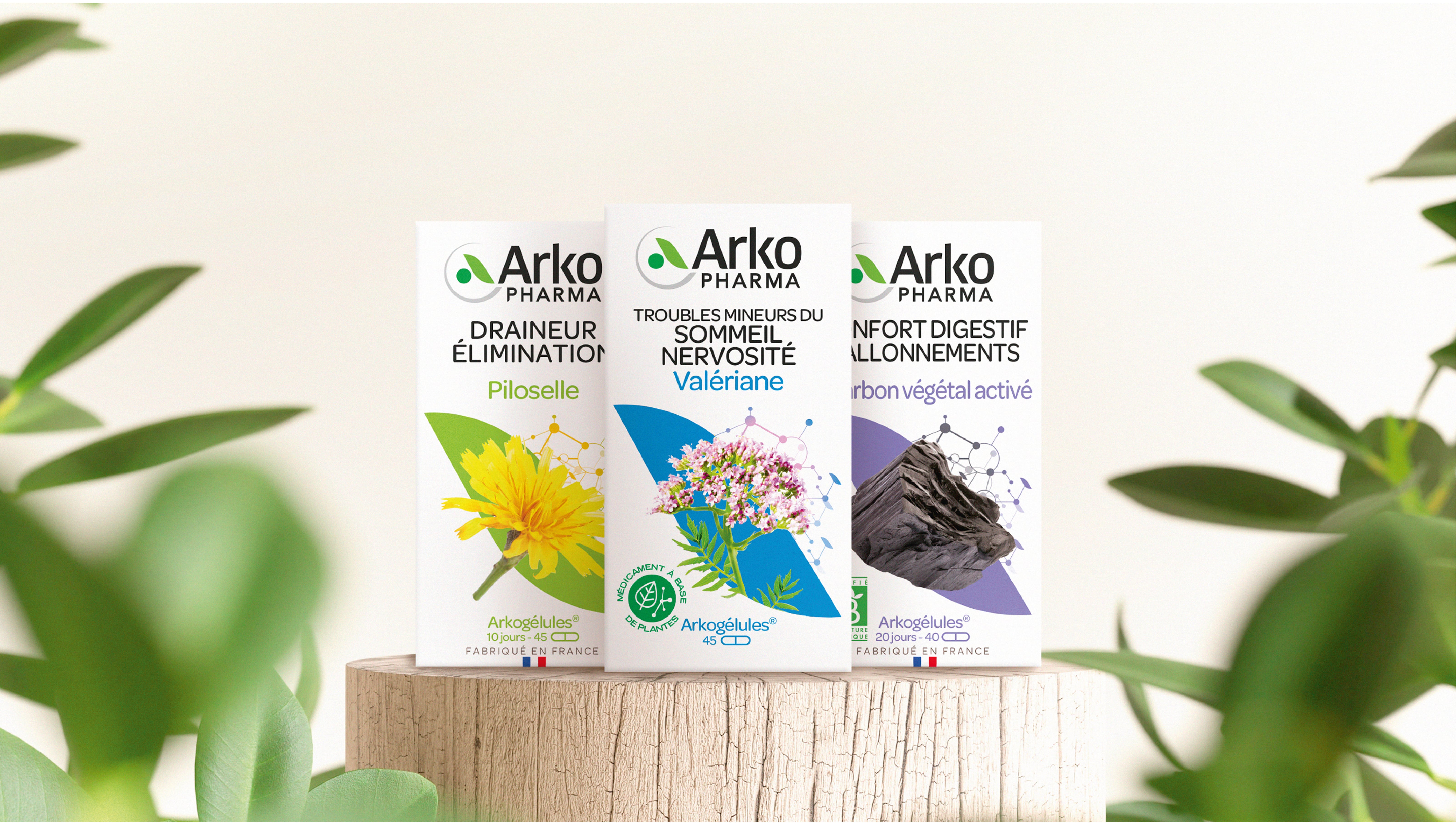
Each element of the identity has been designed in synergy to express Arkopharma’s positioning : the intelligence of nature.
– The logo, impactful and statutory, and the scientific molecules reinforce its expertise.
– The white of the packaging underlines the serious and safety of their products.
– The green of the icon expresses the naturalness and essentiality of their formulas.
All of this elements combine, allows us to create a clear, uncluttered and impactful packaging.
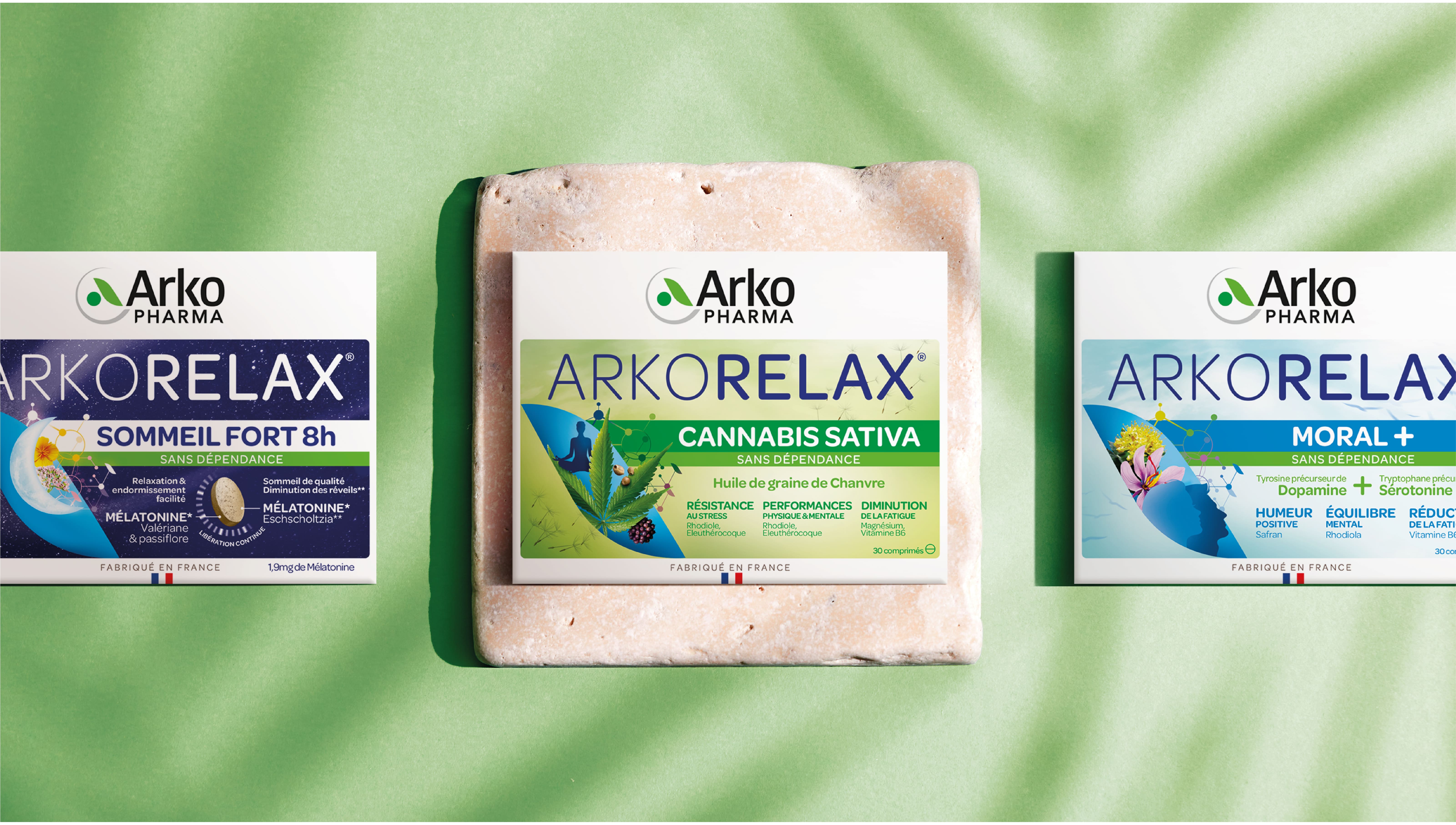
The simplicity and flexibility of our identity allows us to highlight the specificity of their different daughter brands. All of this while ensuring a graphic transversality on all their products.
Discover our other case studies : here