Since the 1970s, Tic Tac has become the daily partner of millions of consumers. This is thanks to its unique recipe and iconic format. As a result, the brand has become synonymous at every cool break.
Today, however, the brand needs to take a new step and become a ‘powerbrand’ capable of encapsulating a wide range of innovative ideas.
Tic Tac logotype
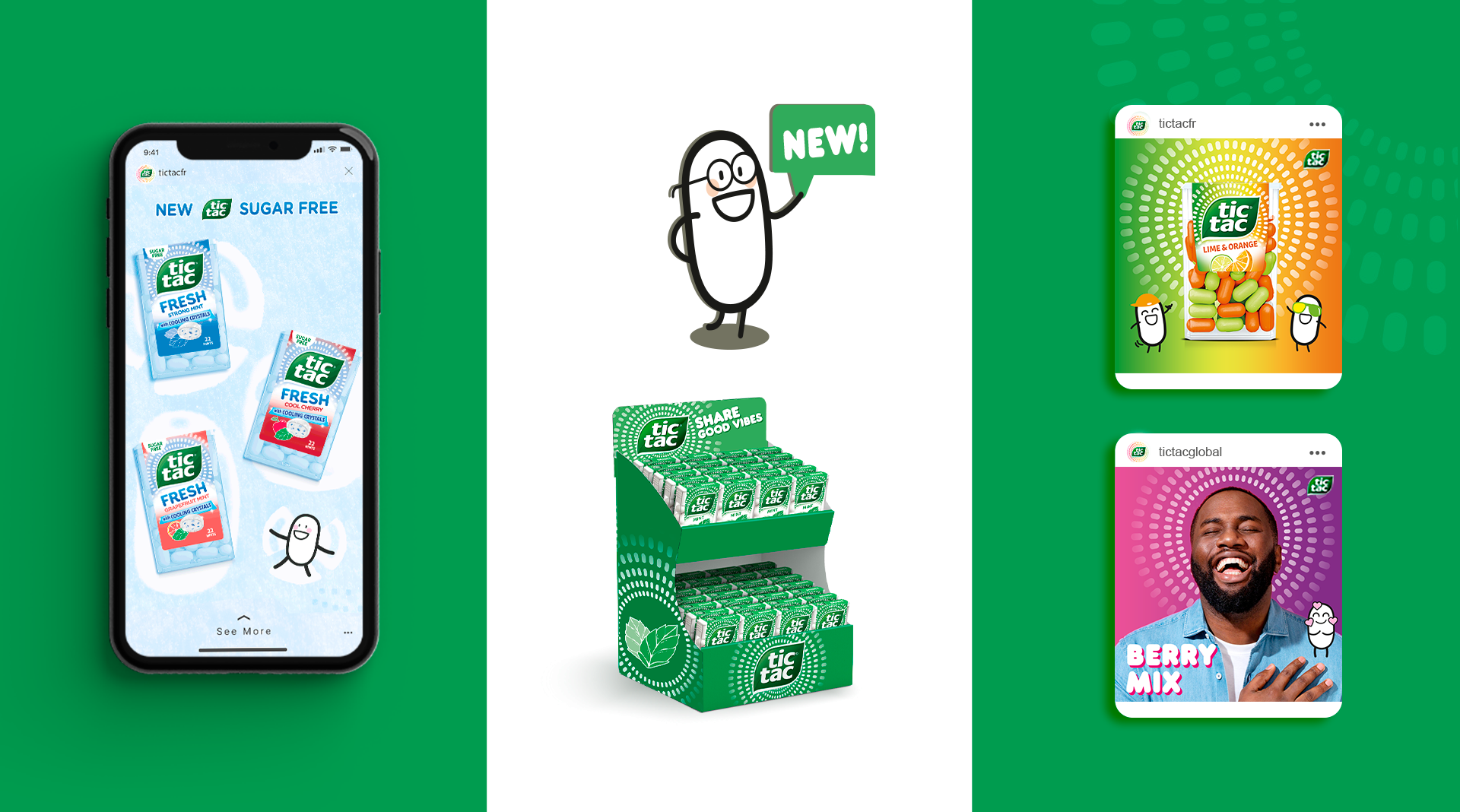
Team Creatif helped the brand in a number of areas. Firstly, with the definition of the strategic platform and the sacralisation of brand assets. And finally, the application to all touchpoints, with a focus on new packaging designs.
Tic Tac new identity
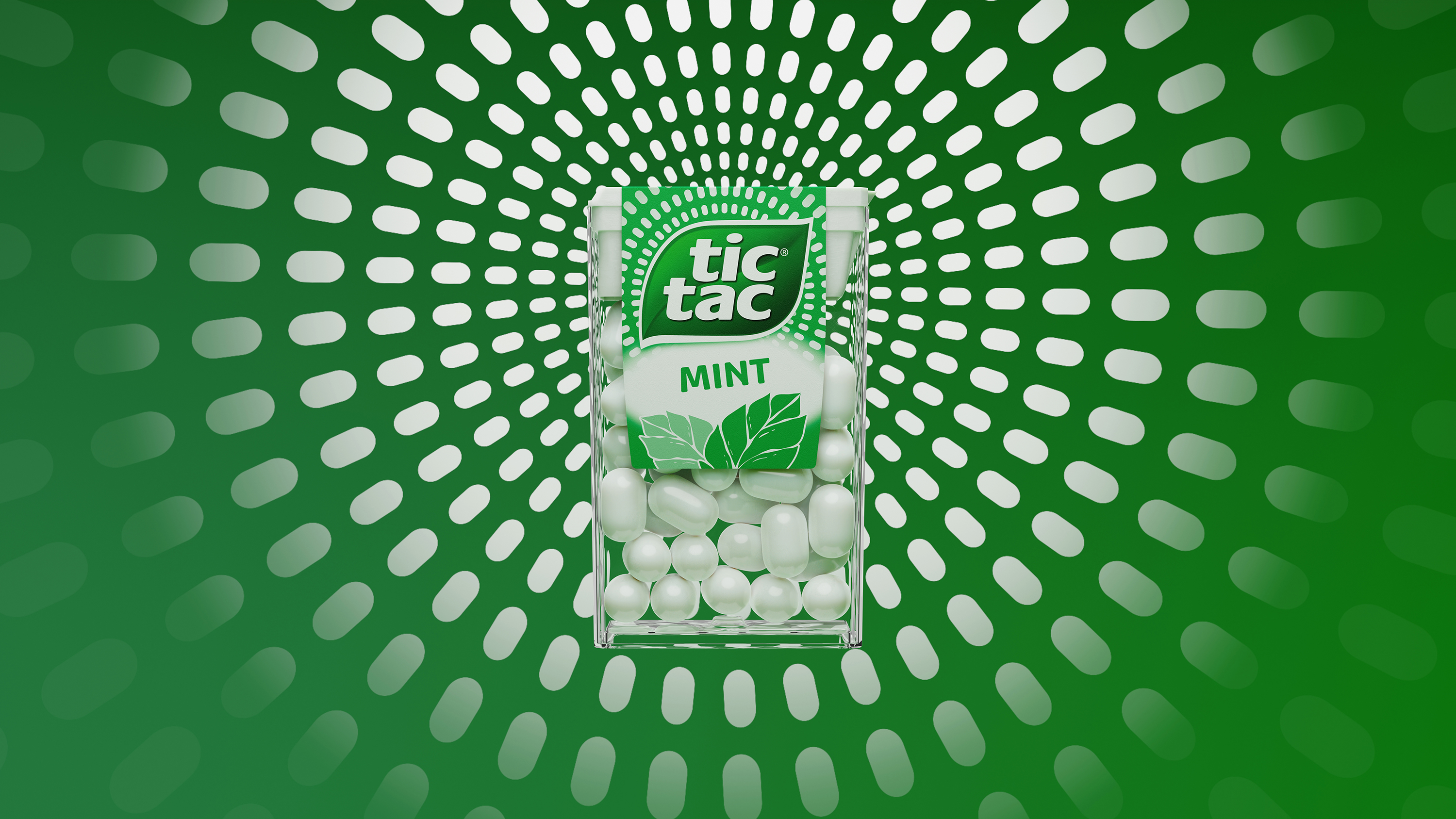
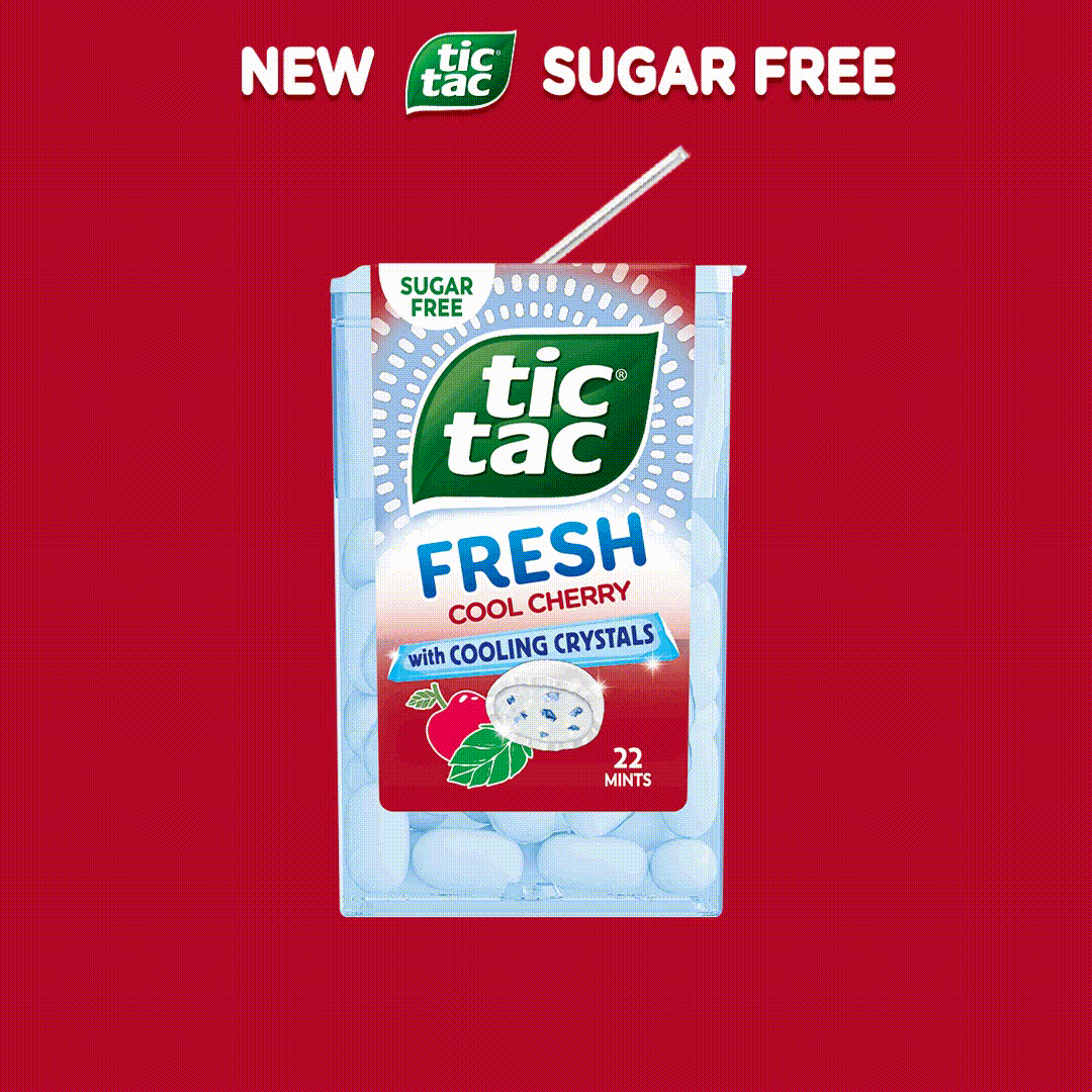
The agency is rethinking the brand’s distinctive elements. The logo has been simplified for greater impact and immediacy. Linked to the new graphic system for the brand and the definition of the new structure, the agency created an iconic graphic system, able to stand on its own to represent “TicTacness”.
This branding logic ensures consistency across all touchpoints and anchors the brand in its new tone of voice.

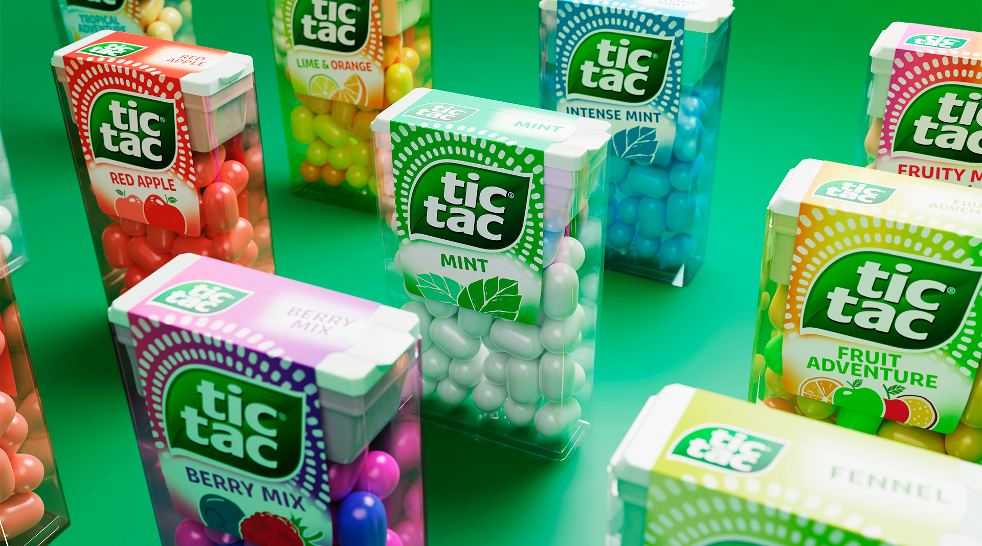
A worldwide identity
This global redesign, which covers 40 countries, reinforces the iconicity of the brand while deeply respecting its history. It is a perfect illustration of the agency’s expertise in managing global branding and distinctive assets, as well as its strategic vision of international megabrands.

Tic Tac design twist
Benoit Chaix De Lavarene, Managing Director of Team Creatif Group, is the guest on BE SMART, a news programme dedicated to the economy and finance. Find out below how our teams helped the Tic Tac brand.

See more cases studies : here