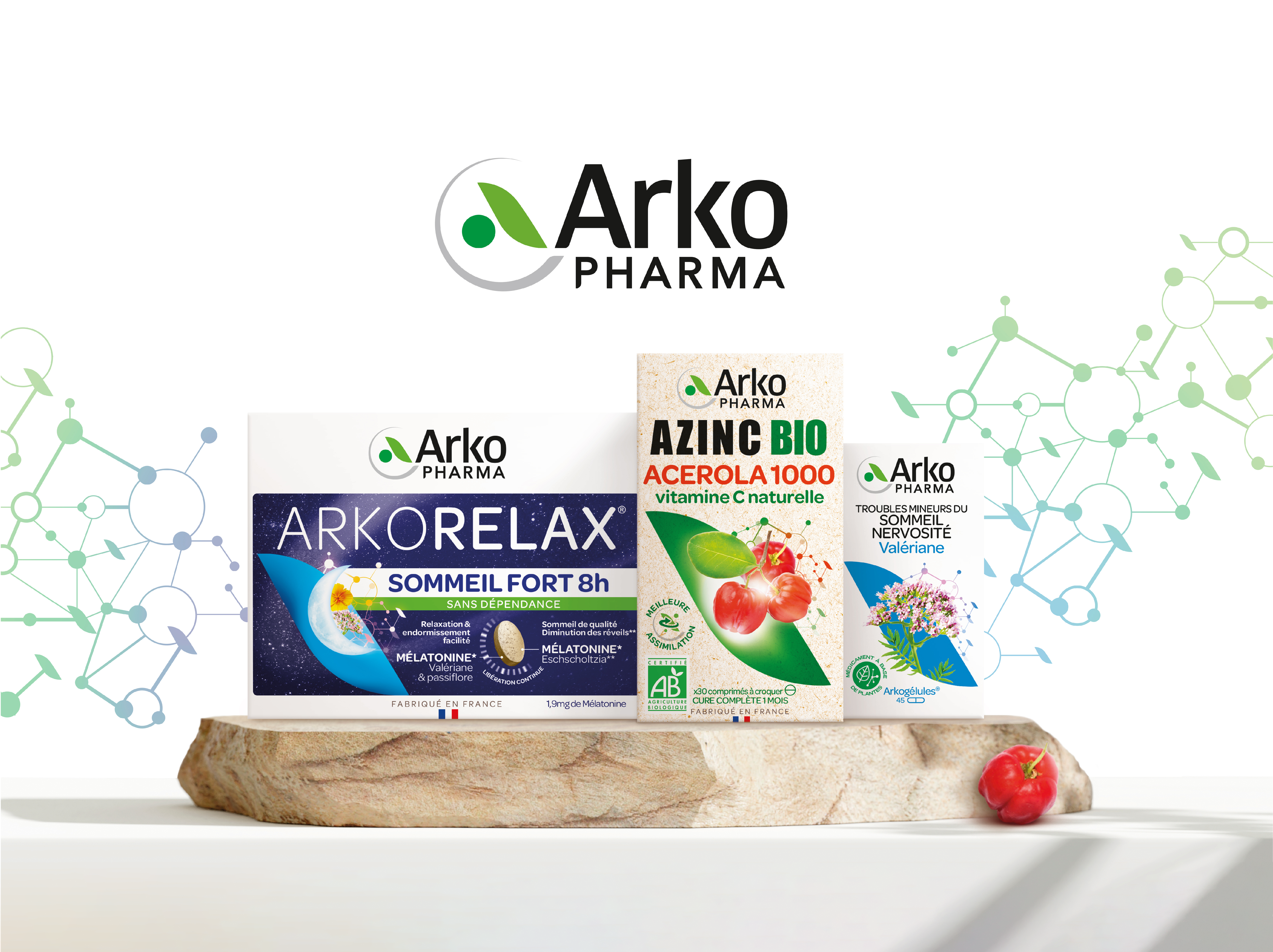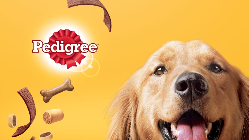
Reworking a brand image
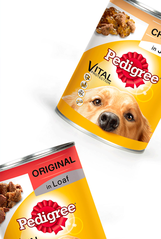
Pedigree’s core belief is that dog food should be both high in nutritional value, as well as affordable and accessible to all. Before enlisting the expertise of Team Creatif in 2013, Pedigree product packs differed for each range from one country to another, making for a very confusing, disjointed global identity. That’s when Team Creatif stepped in and reworked their entire global brand image. A more consistent identity was developed with new, more coherent packaging rolled out across all ranges.
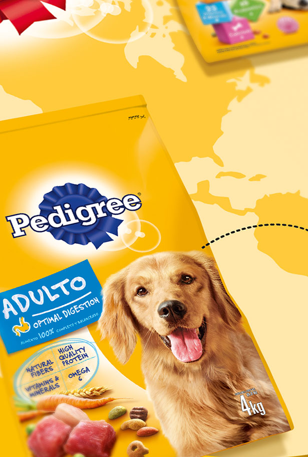
Rebuilding brand positioning
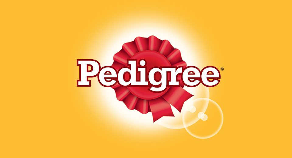
When Pedigree decided to rethink its brand structure, they called on the 30-year expertise of Team Creatif. The goal was to improve stand out in the shelf environment, and communicate the nutritional qualities of Pedigree products throughout the world. The red and yellow logo (or blue and yellow for the USA) is the brand’s signature visual asset: a luminous halo that shines out from the iconic rosette conveying the dog’s vitality and expressing the design’s warmth. The graphic codes are simple and easy to understand across all markets for Pedigree’s worldwide culture of consumers.
Powerful concepts
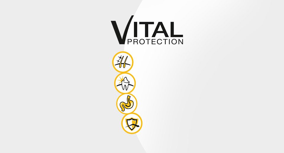
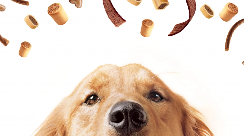
Team Creatif was asked to rework the logo and the Pedigree portfolio across all three ranges: Dry, Wet, and Care & Treats. The objective was to help consumers navigate across all three product ranges, while positioning the brand as an expert with a passion for all things dog. Each product is presented in a highly approachable way, with a modern design that reflects the specificity of each of the three ranges. Compelling visuals of happy, healthy dogs are used on pack to engage the consumer and drive understanding of the brand story.