Born and established in France for over 70 years, the Panzani Group is writing a new page in its history: a new dynamic based on the group’s values.
Team Creatif was asked to build the narrative platform, the vision and mission, the values of the company and to embody them in a new corporate identity.
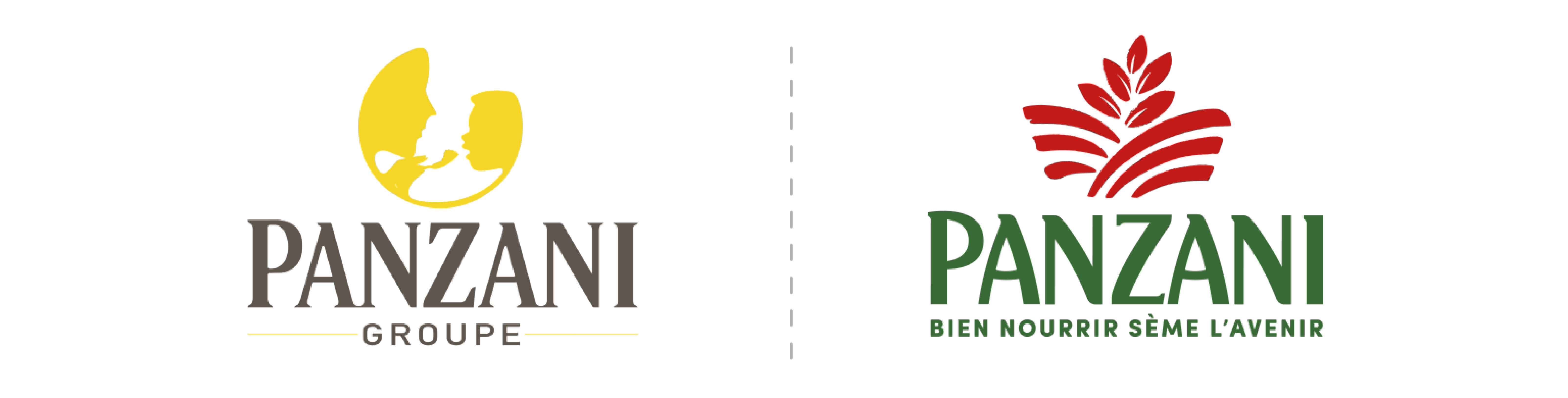
A new identity, based on the Group’s roots
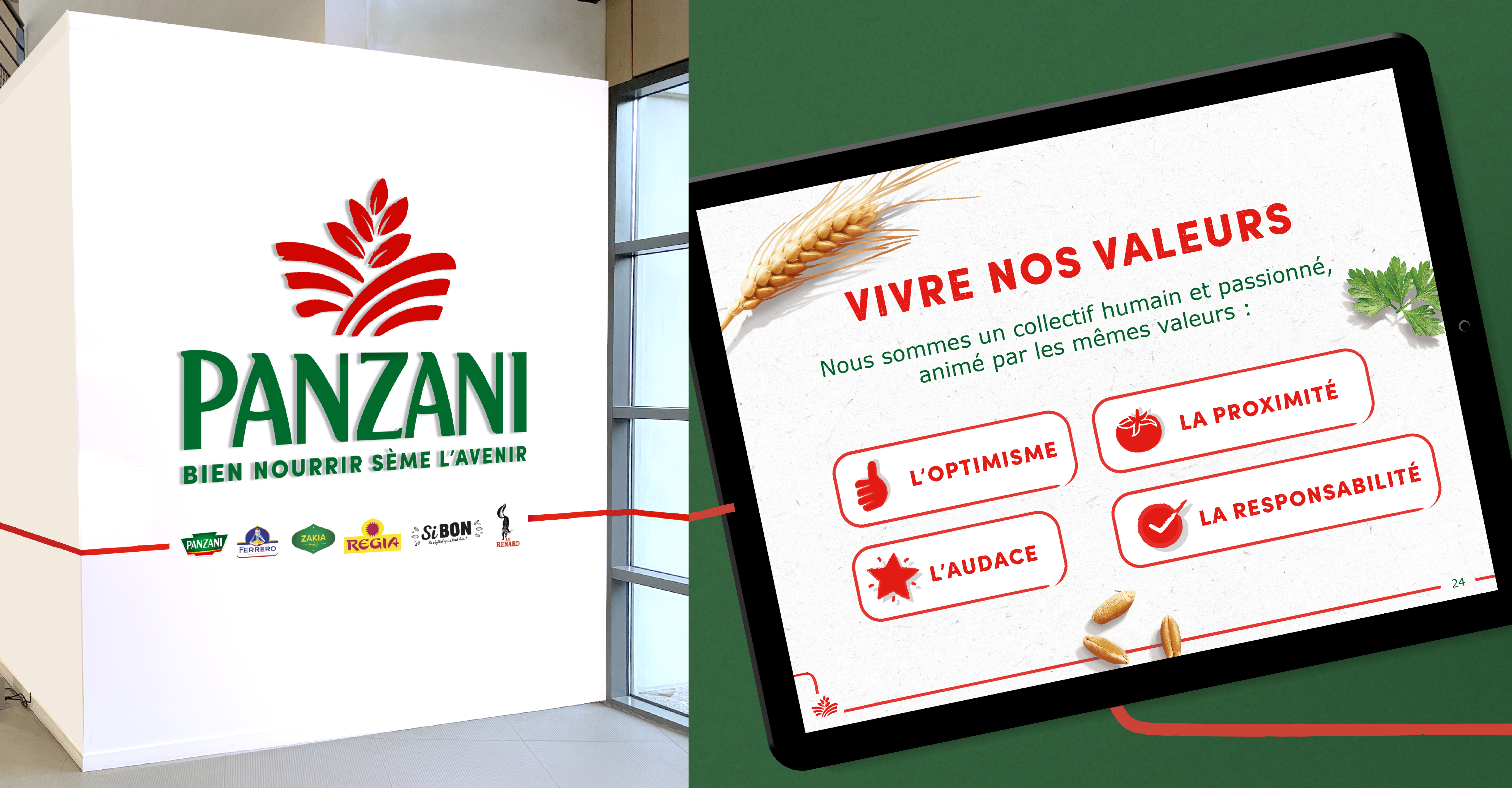
Team Creatif has come up with a strong, unifying new corporate identity, rooted in the Panzani Group’s roots.
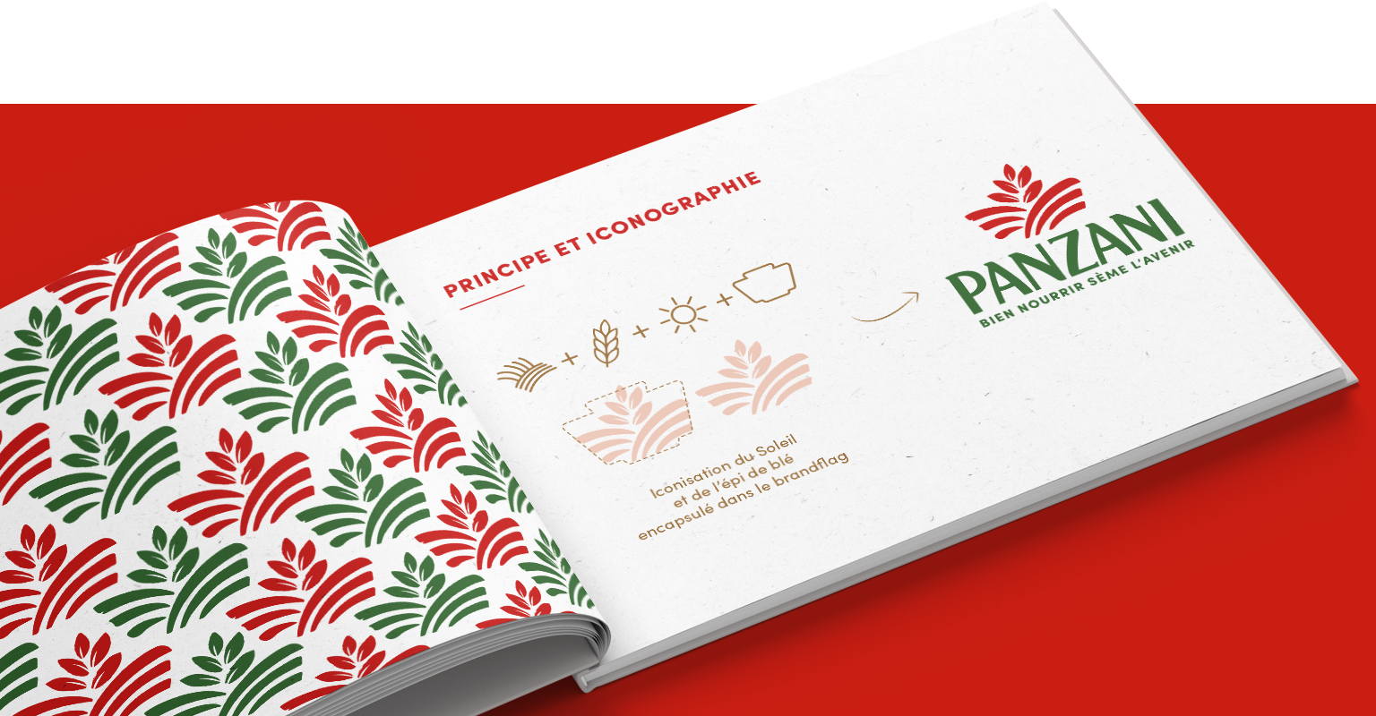
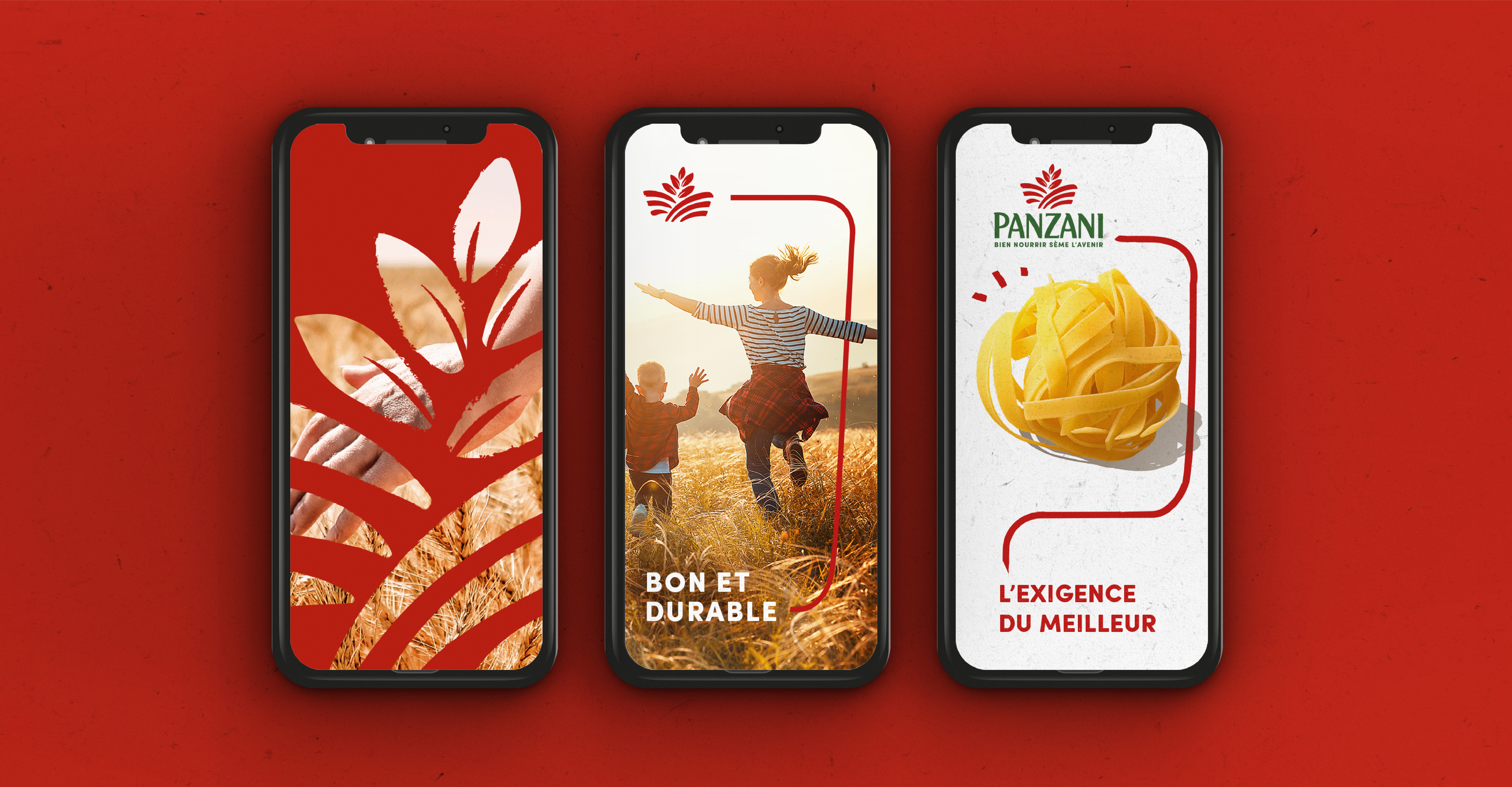
The sun icon reflects the unique expertise of all the Group’s businesses: “from field to plate”. A statutory typography affirms the strength and confidence of the Group’s brands. The colors come from the historic Panzani brand, with its Italian roots. Green for naturalness. Red for impact and taste, and white to illustrate the healthy side of the Group’s products.
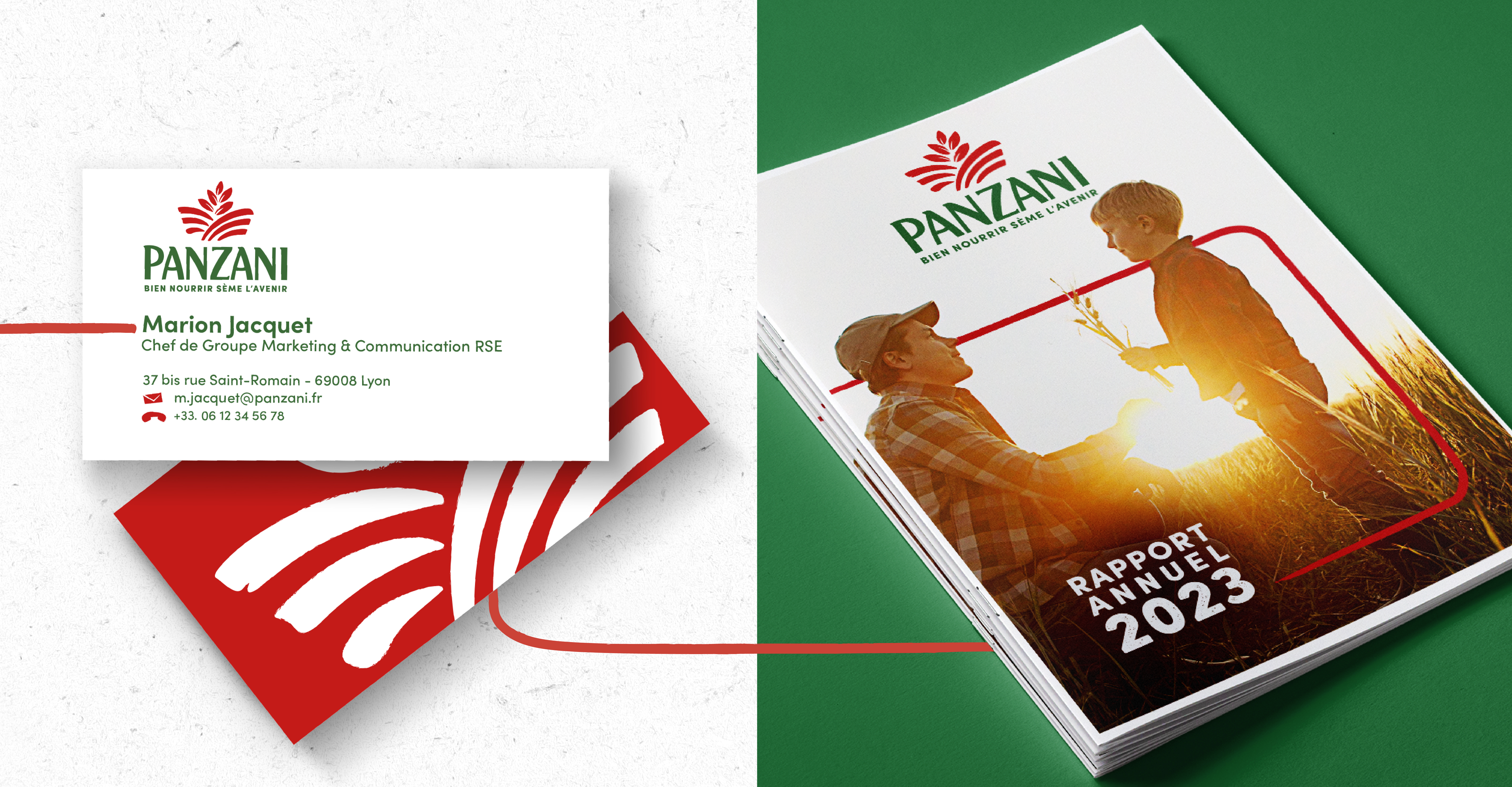
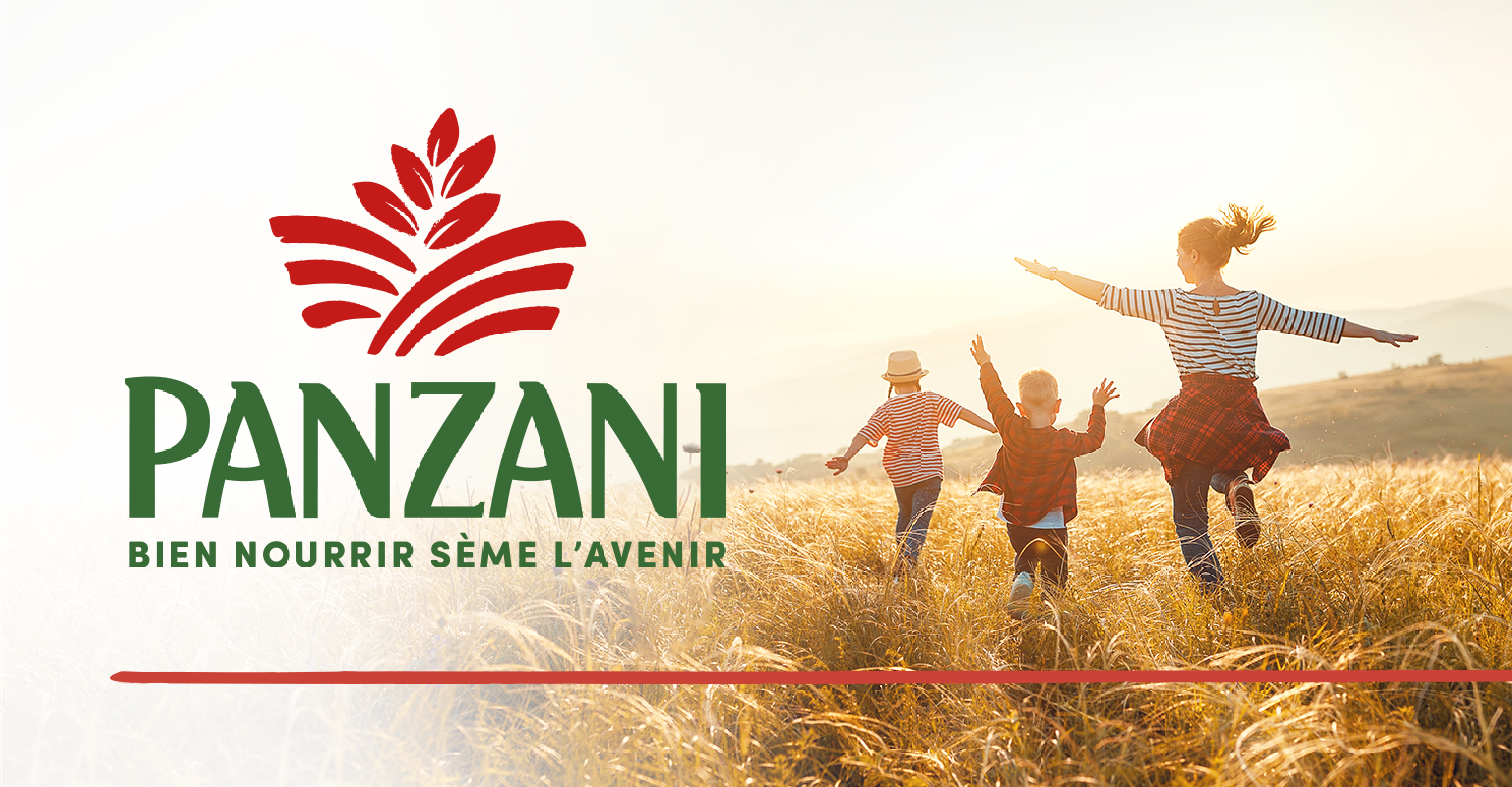
Finally, an elegant, clean graphic style illustrates the Panzani Group’s mission: “Feeding well sows the seeds of the future”. Offering everyone responsible food that nourishes as much as it delights. It’s a style that we’ve used on the group’s various media – website, business card, guidelines, and soon in the new Panzani offices.
Panzani, a brand that builds bridges
This transformation is supported by a red line symbolising the link between people, from the farmer to the head office employee, via the teams at the seed mills, production plants and R&D centres. This connection also reinforces the stability of the Group’s brands.
See more of our work : here
Panzani & Team Creatif on the media CB News and Stratégies.