Star of sweets
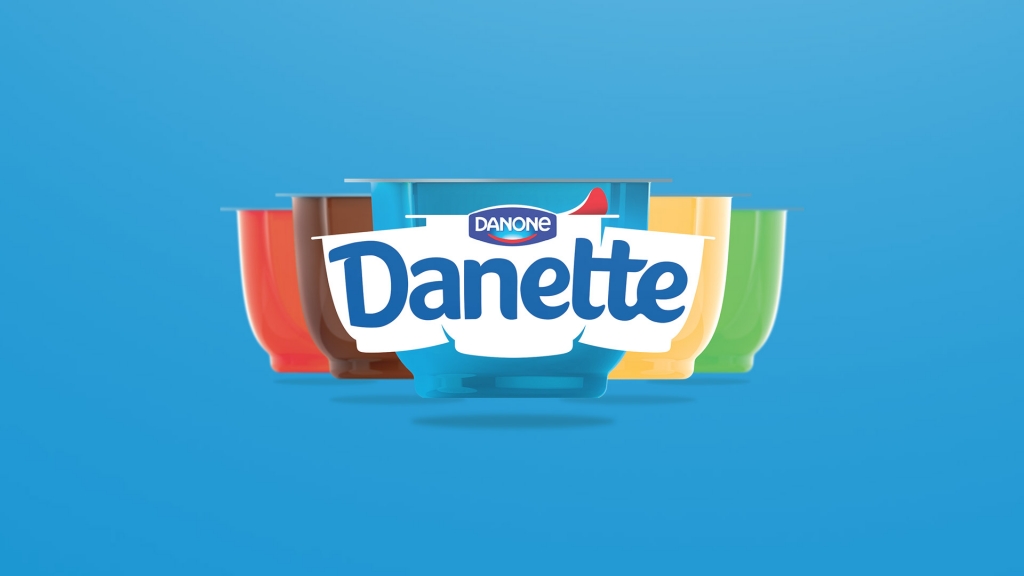
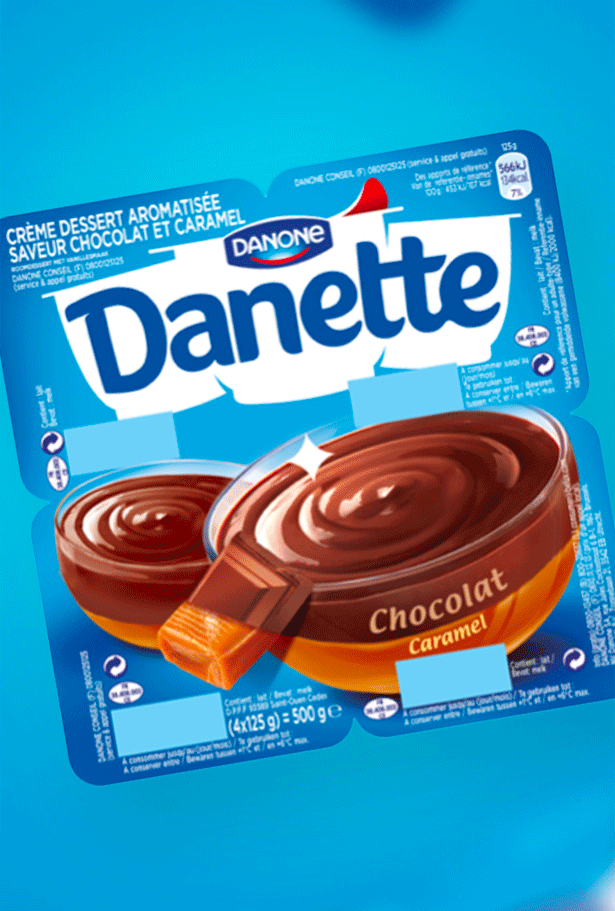
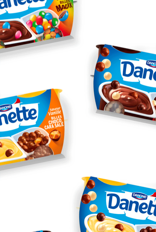
A creamy dessert with a rich texture in an easy-to-spot pot that takes center stage on the dairy shelf, Danette spent years standing out from the crowd in the ultra-competitive market of fresh dairy products. However, after a decade of stagnant design, it was time to add a more contemporary touch to this star brand.
Reaffirming historic leadership
In 2017, we defined two main objectives for Danette: developing an iconic identity based on the brand’s historic leadership and restructuring the whole range to ease navigation and make it more cohesive. The primary goal was to integrate the latest innovations, while making it easier for consumers to find their favorite existing product varieties.
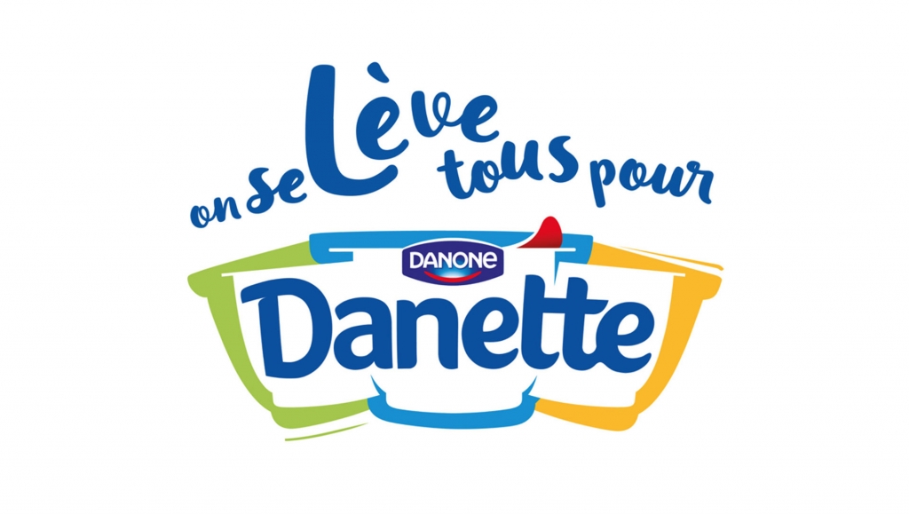
A new logo for a new era
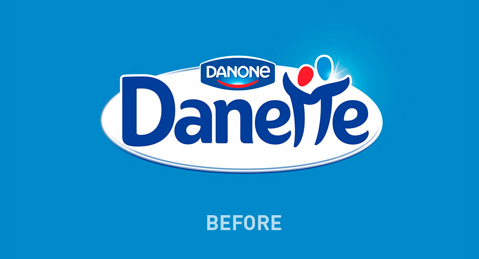
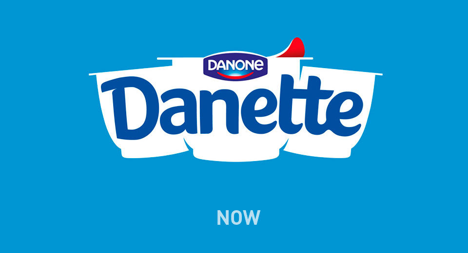
Famous for its signature Danette pot, this iconic shape became the obvious starting point for the redesign. The logotype, on a white background, was reworked for greater simplicity and impact. The opening of the lid, shown graphically in red, adds an instant touch of taste appeal. The label is transparent, allowing for superior navigation of the Danette logo and variety. Visibility of the logo on the pots is key to capturing consumer attention and is the most visible element on self.
1970
Danette is born
58%
of french consume Danette
+7,8%
core business sales