New brand platform & new graphical indentity
How do you reveal an iconic French Brand and its history while asserting your status as a true producer Brand?
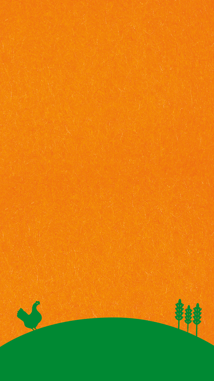
Team Creatif has been invested in St Michel’s repositioning and new graphical identity that insures the perfect balance between heritage, authenticity, tradition & modernity in order to give new life to this iconic French Brand. We have chosen to capitalize on their orange color branding and their historical icon: the hen, while bringing the French flag to the fore. This will help enhance the regional grounding perception of consumers.
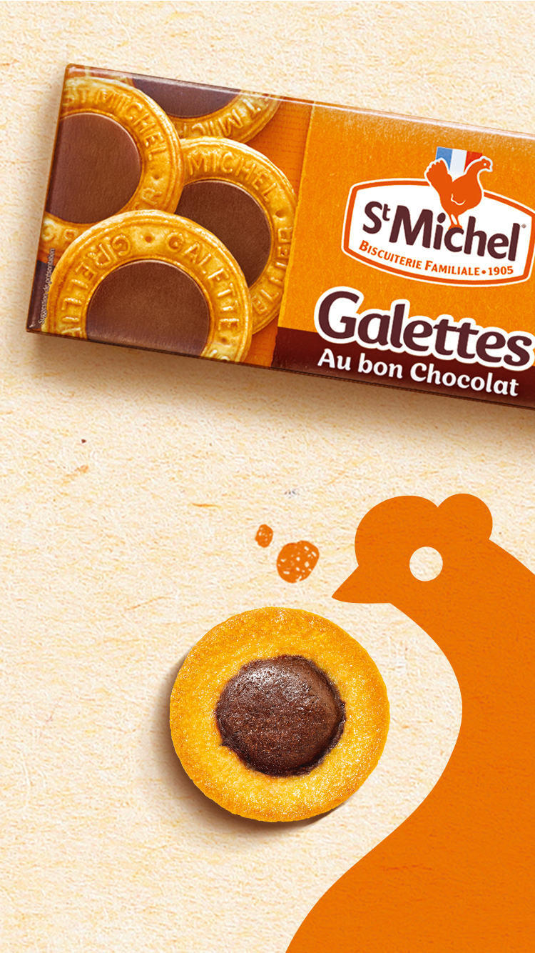
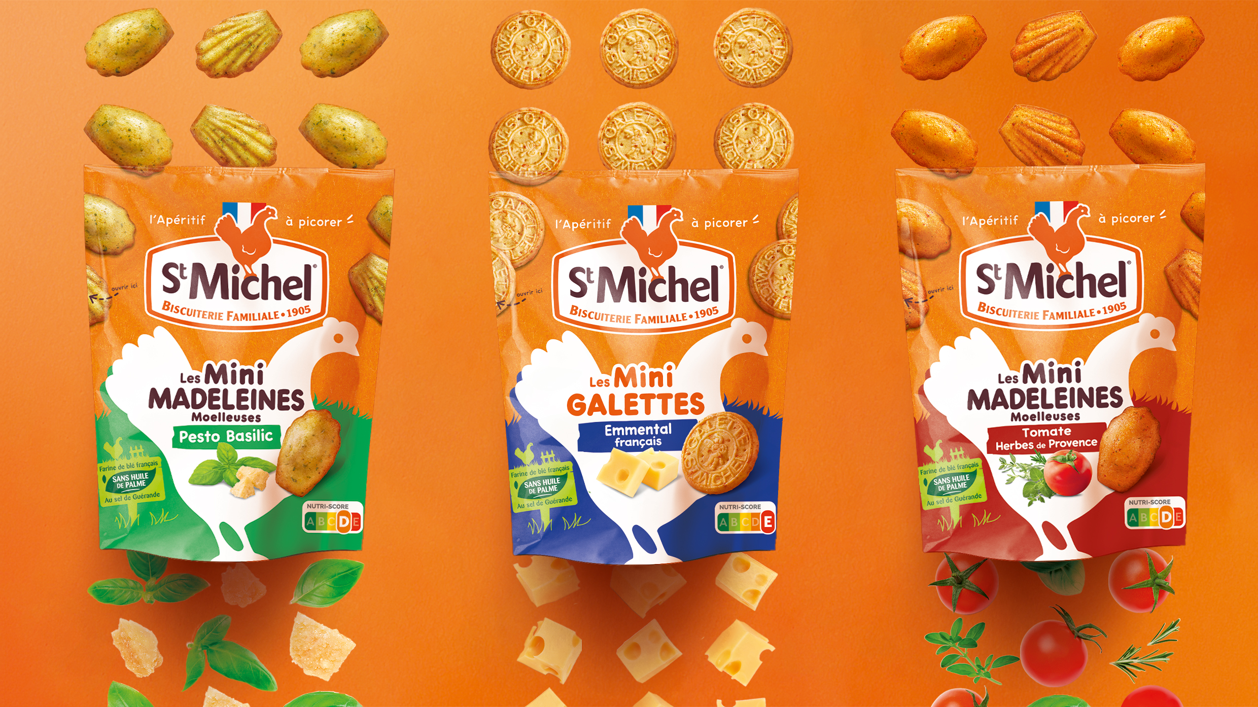
St Michel invites itself to the aperitif !
To create this stunning innovation, our teams have reinterpreted the famous Galettes & Madeleines in a salted version. This innovation in the aperitif market capitalises on the brand’s first point of identification for consumers: St-Michel’s orange colour branding, a fundamental and powerful characteristic. St-Michel’s icon, the chicken, invites consumers to enjoy ‘an aperitif to be pecked at’. This brand new, impactful and colourful design highlights these 2 audacious innovations, always made from the highest quality ingredients, a sign of the brand’s commitment.
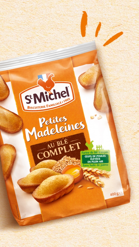
The St Michel commitments
St Michel has been pursuing the artisanal spirit of making great cookies. It is an ancestral family product made in their own workshop with locally sourced ingredients : free-range chicken eggs, French-grown wheat and no palm oil…
Team Creatif showcased St Michel’s capacity to offer good simple products that are so yummy and that match the trend of better and more natural eating as well as offering locally made products.
St Michel innovates also this year with an organic range that features inventive and tasty recipes developed by their pastry chefs.
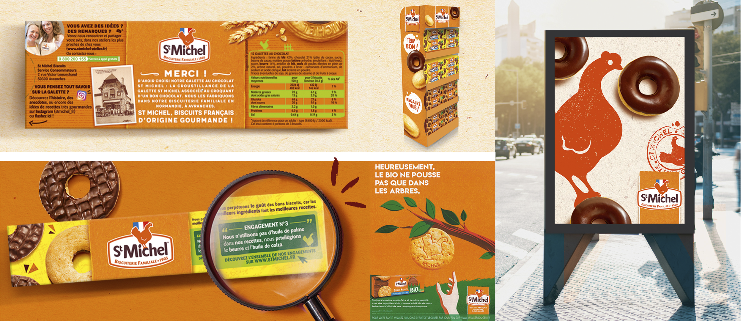
Deploying the BVS
St Michel’s BVS was specifically designed to capitalize on all the Distinctive Memory Assets of the Brand: the logo, the hen icon, the French flag and the orange banner iconic of the new packaging identity we developed. The graphical system can easily be applied by the different partner agencies that support the communication online and offline. This BVS will guarantee a transversal consistency for all of St Michel’s touch-points.