TIC TAC arrived in Europe in the 1970s and immediately became part of our daily lives, thanks to its iconic recipe, a minty heart coated with vanilla sweetness, but also thanks to its practical format, allowing it to follow us on our every adventure. The brand has thus become an essential to have in your pocket for a privileged moment of sweet freshness, at any time of the day.
However, today TIC TAC wants to go further and make this moment of freshness a moment of sharing, joy, pleasure and optimism and has chosen Team Creatif to take up this challenge.
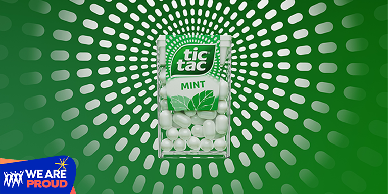
The agency designed the worldwide redesign of the iconic brand
The agency has revisited the logo and the ingredients library to evolve and enhance modernity, refreshing an icon and introducing a new strong asset of the brand : the rays of positivity. Emanating from the logo, they release and radiate the freshness of TIC TAC, its spontaneity & all its positive vibes, for a strong sensory and emotional benefit. The agency has created a real graphic system around these rays, which can be used endlessly on-pack and off-pack to reinforce the brand’s new identity at all consumer touchpoints.
This global redesign reinforces TIC TAC’s iconicity, visibility and modernity on the shelves while deeply respecting its historical DNA, a perfect illustration of the design agency’s know-how in the branding and strategic management of international Megabrands.