RECONNECTING WITH
ITS TRUE NATURE
Challenge: JBlack Forest had a strong premise: real fruit, better-for-you, nature-rooted. But the brand lacked clarity, consistency and emotional distinctiveness. It felt fragmented and disconnected from its own promise.
Group and company: Black Forest is a Ferrara brand. Its promise was already in the product; it simply wasn’t showing in the brand.
Potential: Reconnect the brand with its natural origins and make that promise visible: real fruit, elevated, with a brand that feels pure yet exploratory.
This archetype became the foundation for everything that followed, summed up in one positioning: real fruit, elevated. Pure yet exploratory.
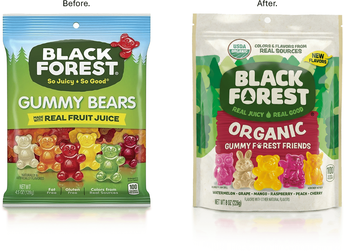
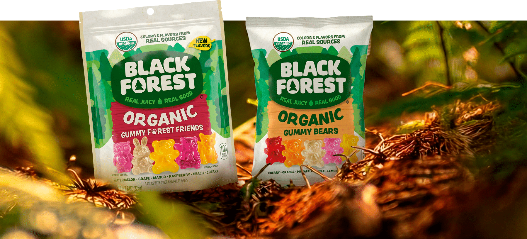
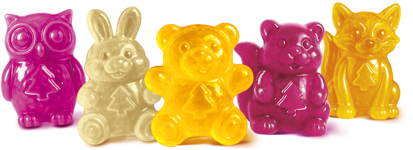
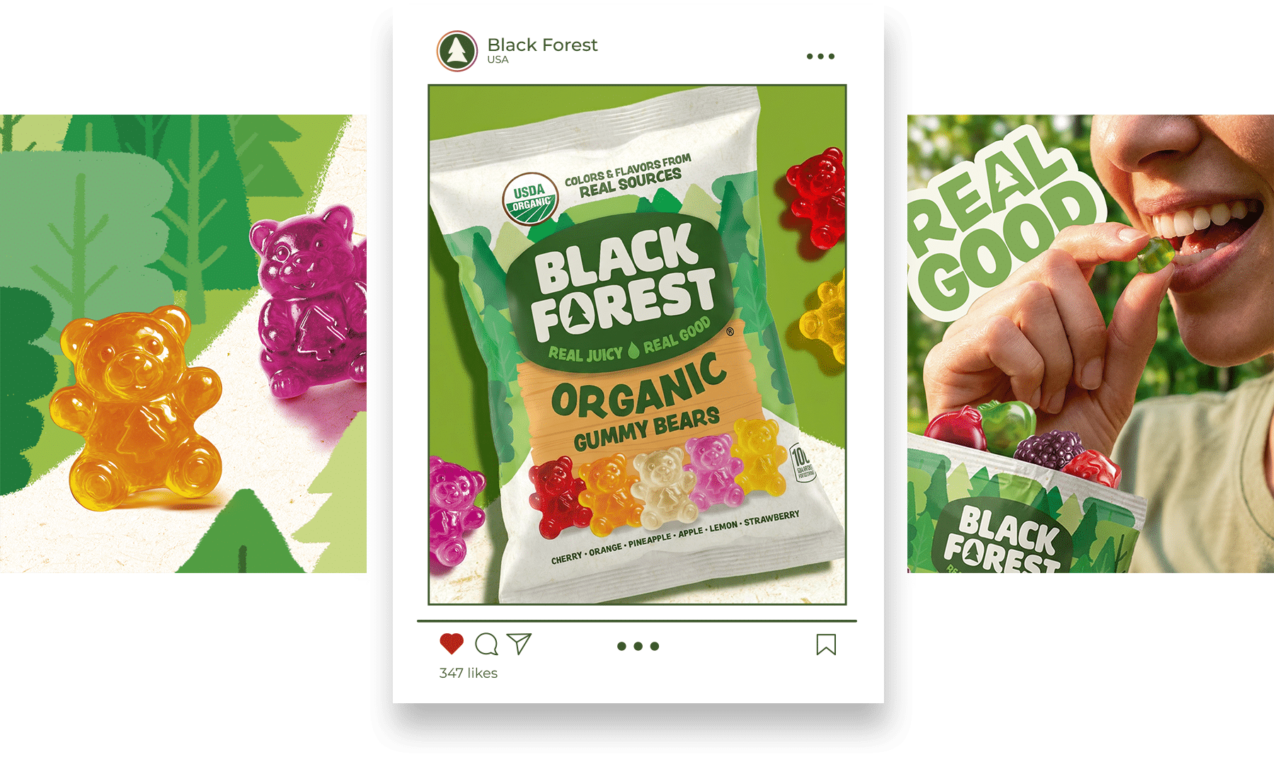
We built a more natural, distinctive and expressive identity system, with a redesigned logo, a refreshed identity and an evolved packaging system. The work covered every brand asset, from logotype, typography and symbol to illustration, photography, tone of voice and product shape.
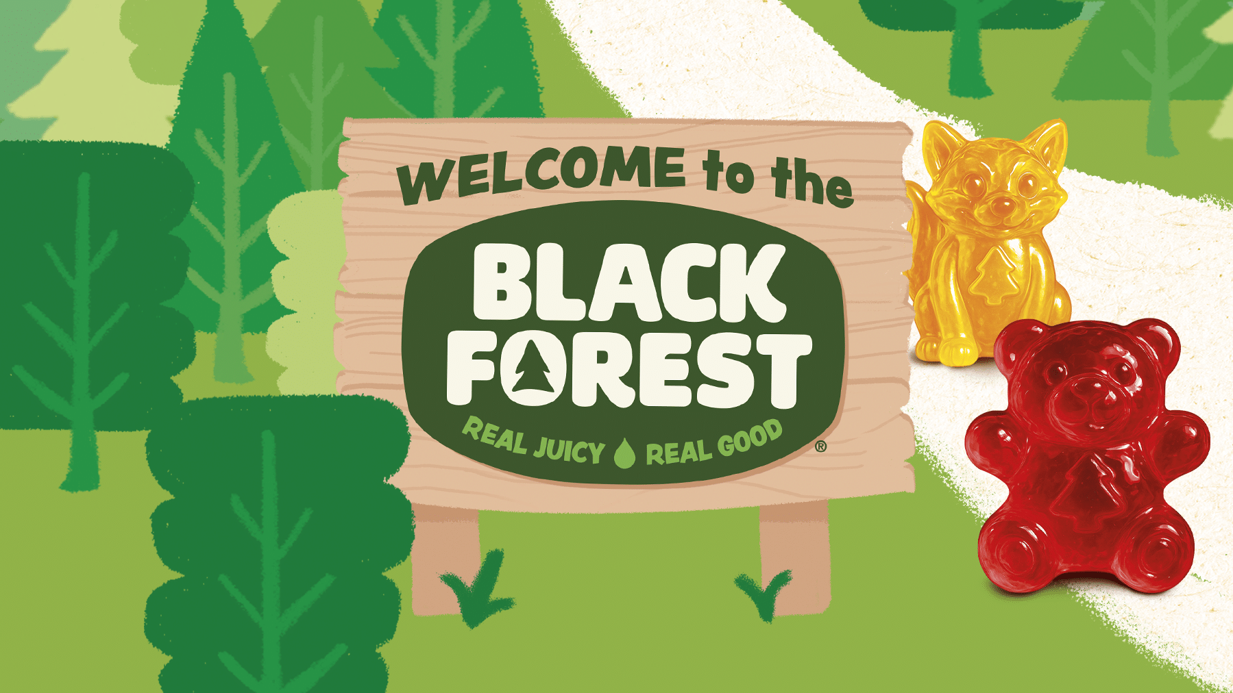
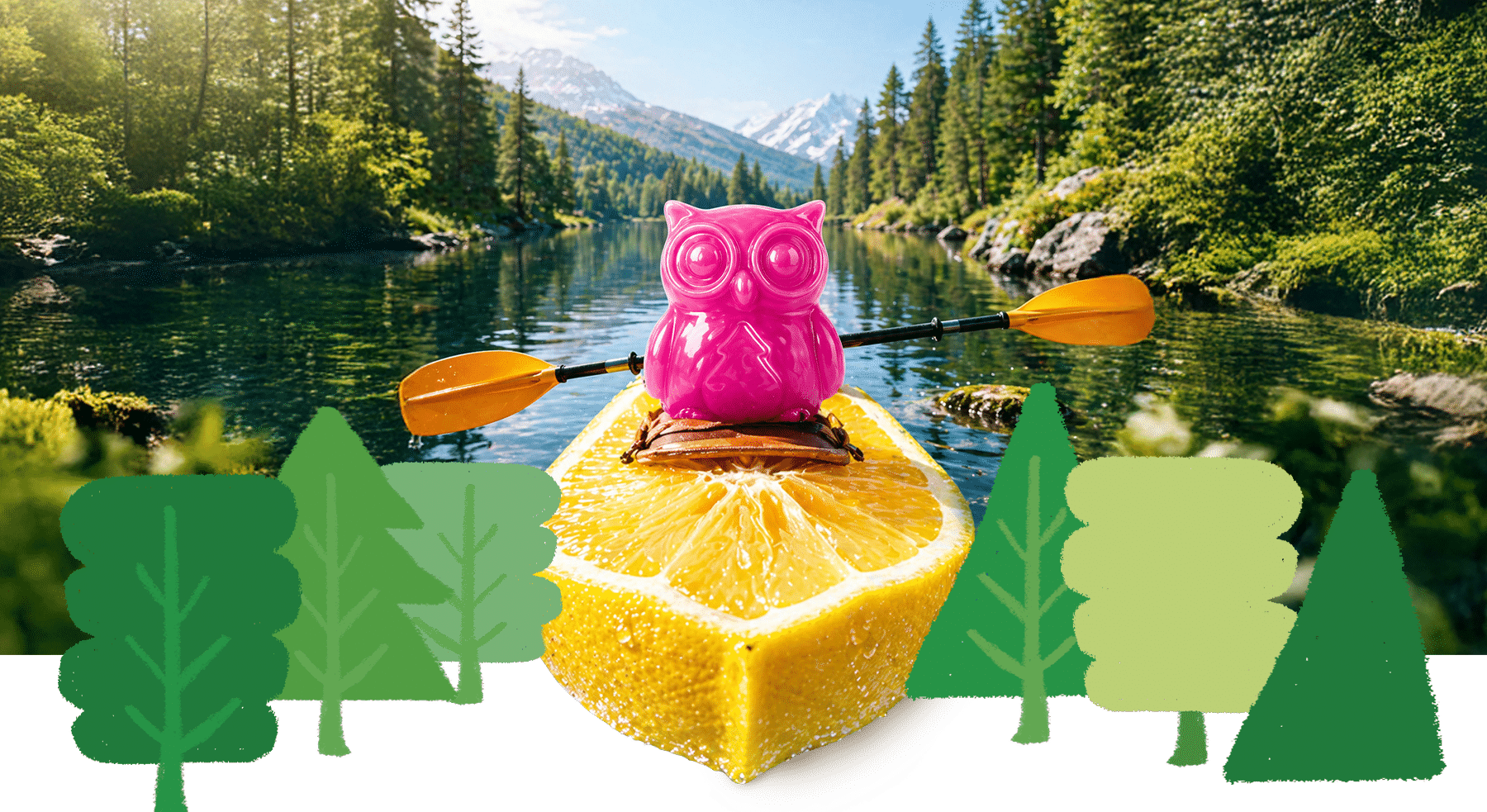
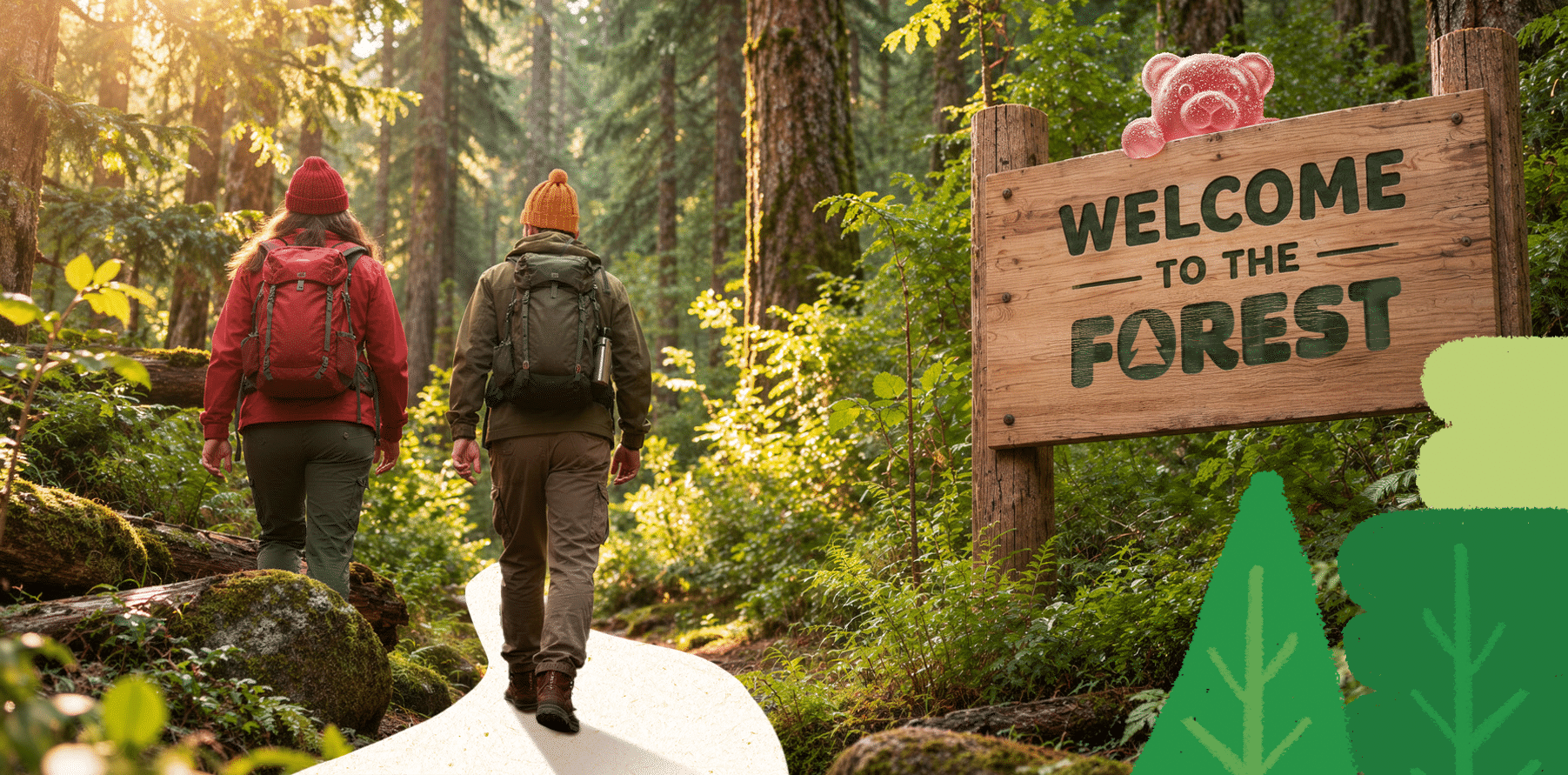
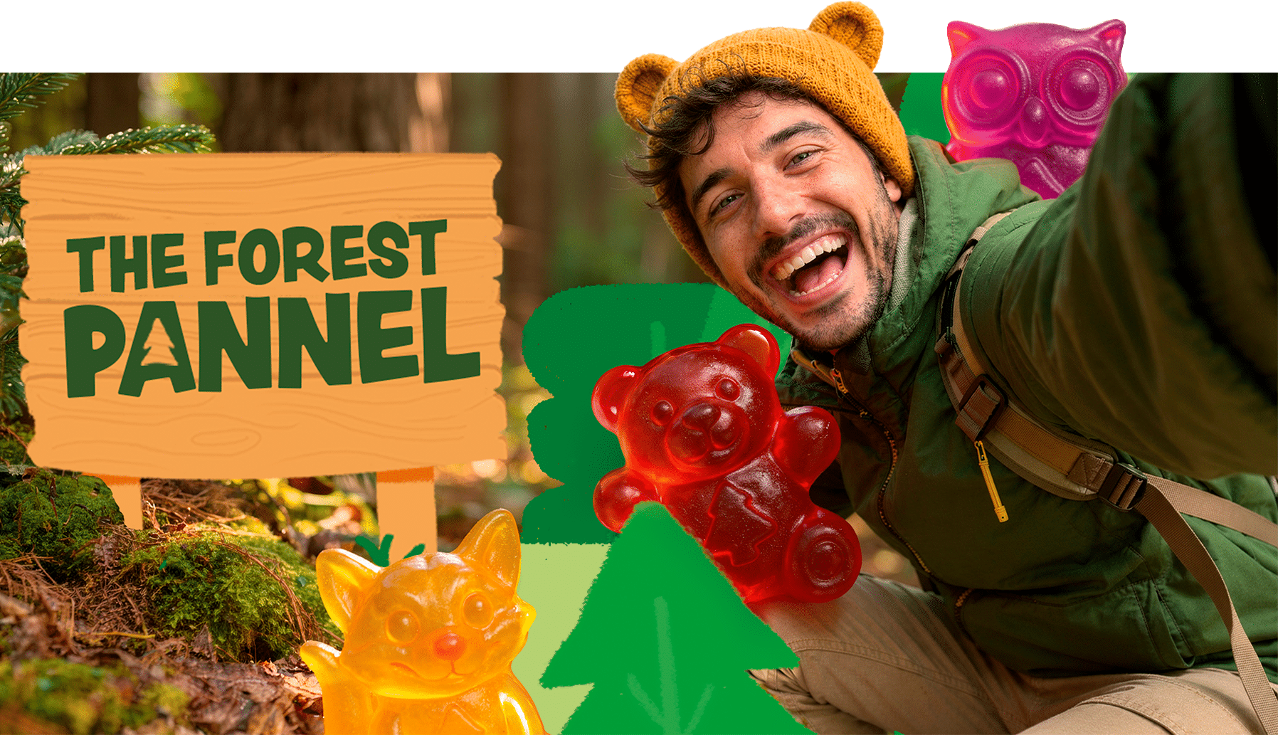
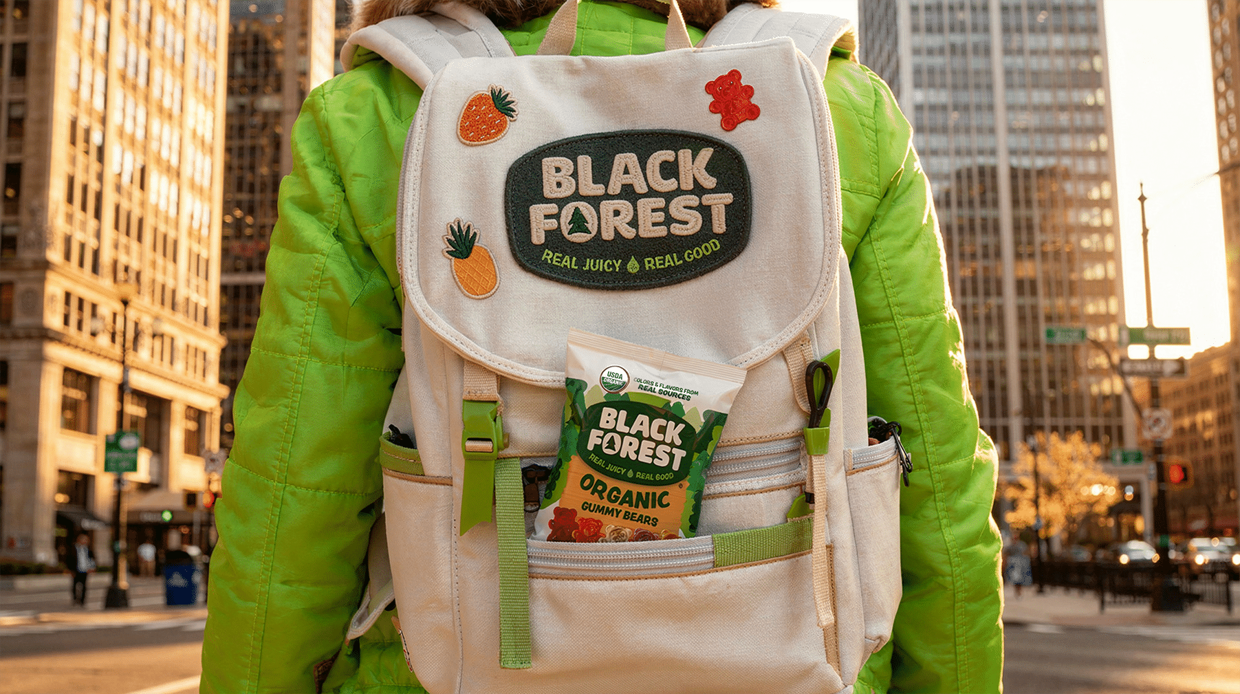
Into the Woods is the creative platform that reconnects Black Forest with its natural origins. It invites people to rediscover the brand through a more authentic, immersive experience, from key visuals to social media.
RESULTS
Black Forest now has a clearer, more recognizable presence and feels more authentic, engaging and distinctive. Going fully organic turned the brand’s promise into proof. Black Forest finally feels like itself.